
Back to Home Page
Case Study
Transforming complex security data into actionable insights through thoughtful interface design and visual hierarchy.
Intro
Build investor trust
Share your story with clarity
For founders, this uncertainty isn't just frustrating—it's expensive. Every day of delayed funding is a day closer to running out of runway. Tellit started with a simple question: What if founders could see exactly what investors do with their materials?
But as I dug deeper, I realized we weren't just solving a visibility problem. We were redesigning the entire relationship between startups and investors—turning one-way pitches into two-way conversations, transforming static PDFs into living, breathing investor experiences.
Overview
One Link. All Your Materials. Complete Visibility.
What Tellit is?
Tellit is an investor relations platform specifically built for early-stage startups. It's where founders create beautiful, trackable investor pages that consolidate everything an investor needs—pitch decks, one-pagers, team bios, explainer videos, and structured Q&A—into a single shareable link.
Who It's For:
I designed this for founders who are actively fundraising and tired of the black hole of traditional pitch distribution. They're sending dozens of emails, following up endlessly, and getting ghosted without knowing why.
The Problem It Solves:
Traditional pitch distribution is broken. Founders email PDFs into a void, investors lose track of materials, and nobody has visibility into what's actually happening. Tellit replaces this chaos with transparency.
The Problem
The Black Hole of Traditional
Every founder I talked to described the same nightmare: You spend weeks perfecting your pitch deck, craft the perfect cold email, hit send to 50 VCs. Then... nothing.
The specific pain points I uncovered:
Once you emailed that PDF, it could go anywhere. Founders couldn't revoke access or update information if metrics changed.
The deck was in Dropbox, the one-pager was a Google Doc, the cap table was in Excel, team bios were on the website.
Without knowing who had actually engaged, founders were either following up too early (annoying) or too late (missing opportunities).
The Solution
Turning Pitch Chaos into Clarity
I designed Tellit around a core insight: Founders don't need another document management tool. They need a platform that treats investor relations as an ongoing relationship, not a one-time email blast.
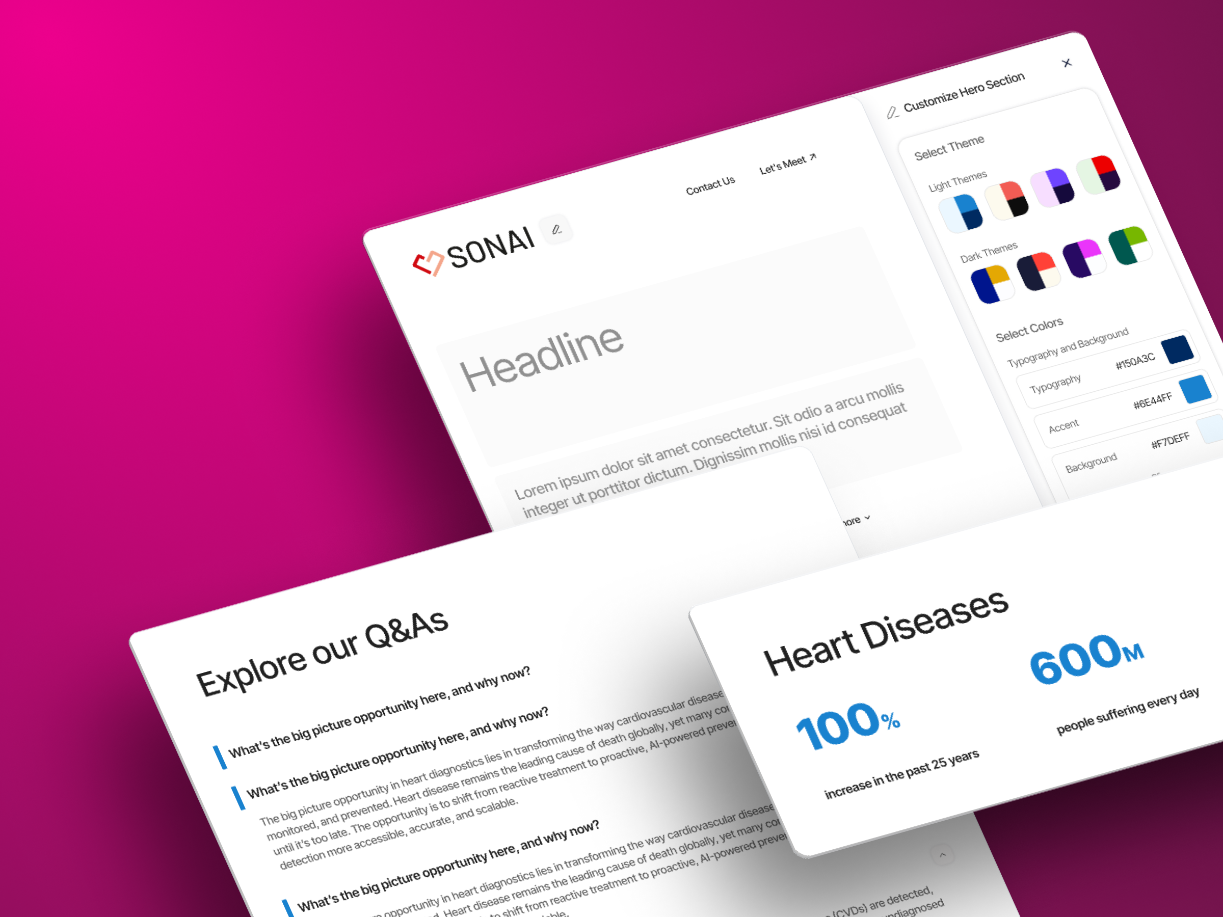
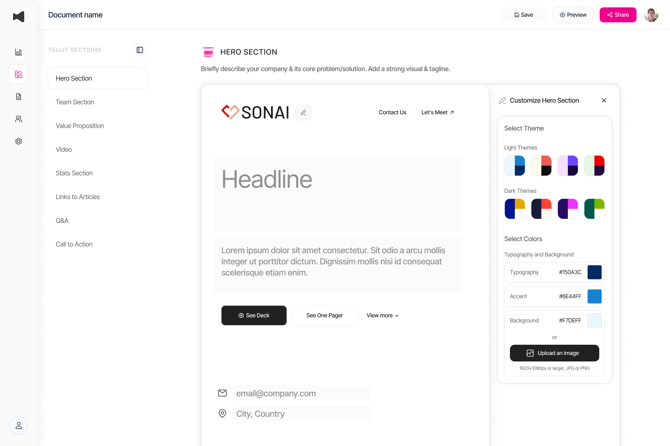
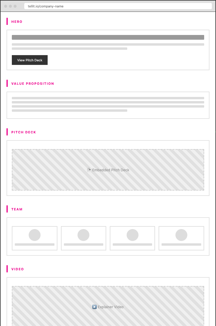
Hero Section: First Impressions That Build Trust
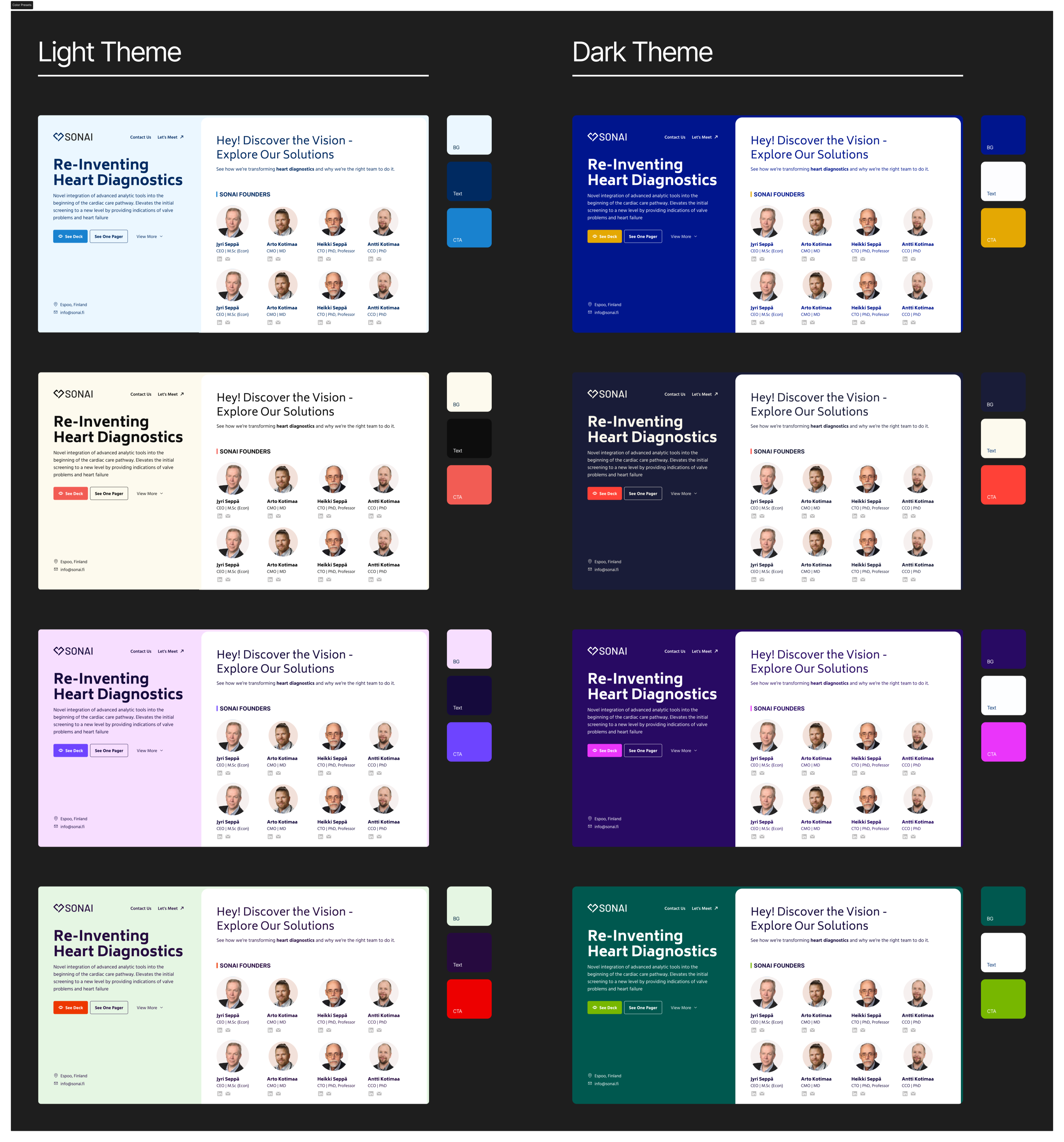
The hero section had to solve a unique problem: How do you immediately convey professionalism and substance while maintaining approachability? I designed customizable hero themes with bold typography that lets founders choose between eight distinct visual identities—from minimal and sophisticated to bold and energetic.
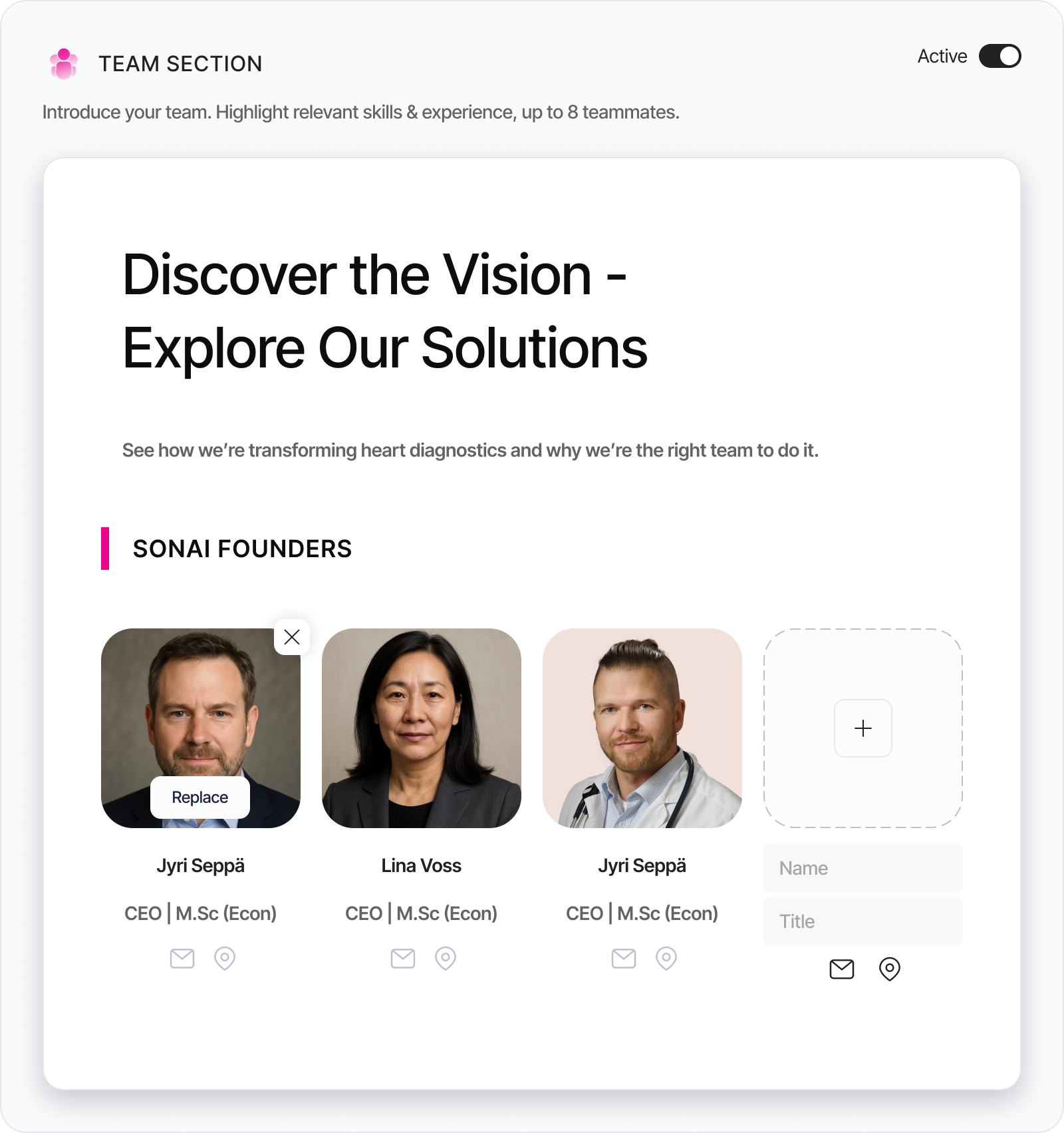
Team Section: Humanizing the Cap Table
Investors invest in people, not just ideas. I designed the team section as a grid of professional headshots with minimal decoration—no fancy hovers or animations that would distract from the faces themselves.
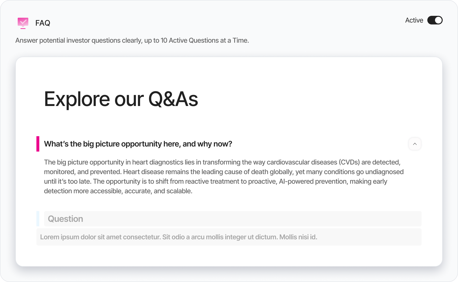
Q&A Section: Addressing Concerns Proactively
Instead of waiting for investors to email their questions, I built an expandable accordion system where founders can preemptively answer the questions they know investors will ask. The analytics dashboard tracks which questions get opened most frequently.
Analytics Dashboard: Data That Drives Action
I designed the analytics system around questions founders actually ask: Who's interested? What did they care about? When should I follow up? Every dashboard widget answers a specific strategic question.
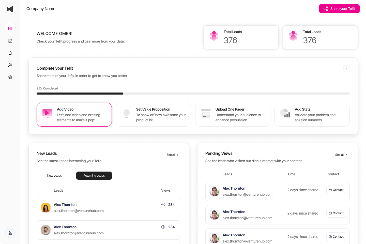
Complete Your Tellit (Onboarding Checklist)
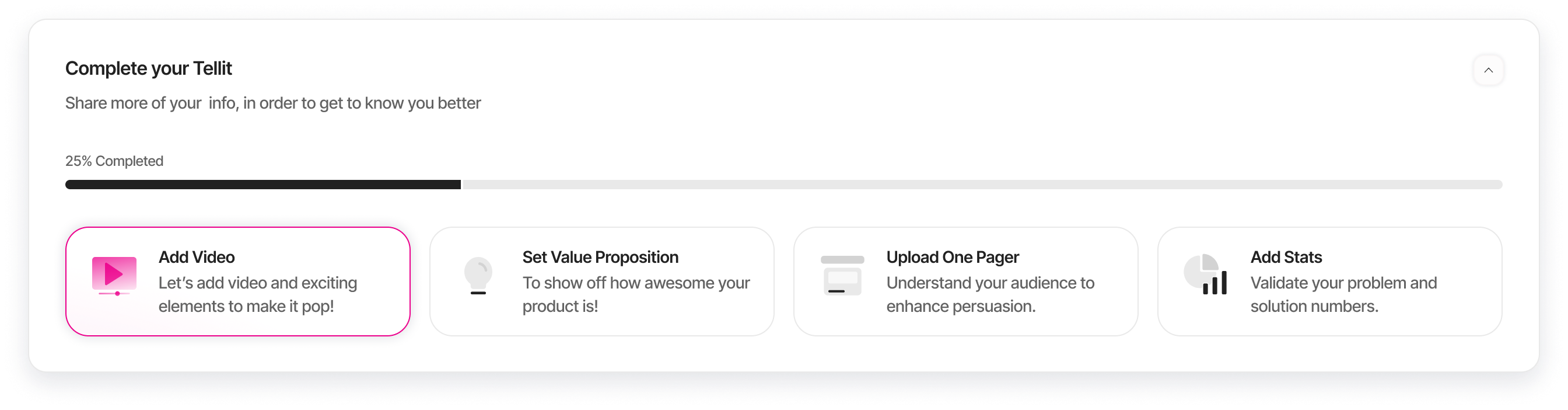
I designed "Complete Your Tellit" as a progressive onboarding checklist that breaks setup into four manageable tasks. The interface shows completion progress at the top (25% completed) and displays tasks as scannable cards with clear icons, titles, and benefit-focused descriptions. The currently active task (Add Video) is highlighted with a magenta border, creating clear visual hierarchy and guiding founders through setup one step at a time.
Founders faced "blank canvas anxiety" when setting up their investor pages. Without guidance, setup completion rates were low (47%), and average time-to-publish was 23 minutes—too long for busy founders. Users needed clear direction on what to complete and in what order, without feeling overwhelmed by all available options.
Investor Page Editor (Wizard)
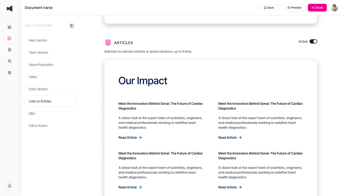
A guided, modular page builder that lets users add or toggle sections: Hero, Team, Value Proposition, Video, Stats, Links, and Q&A. Draft autosave ensures safe iteration; manual Publish commits live updates.
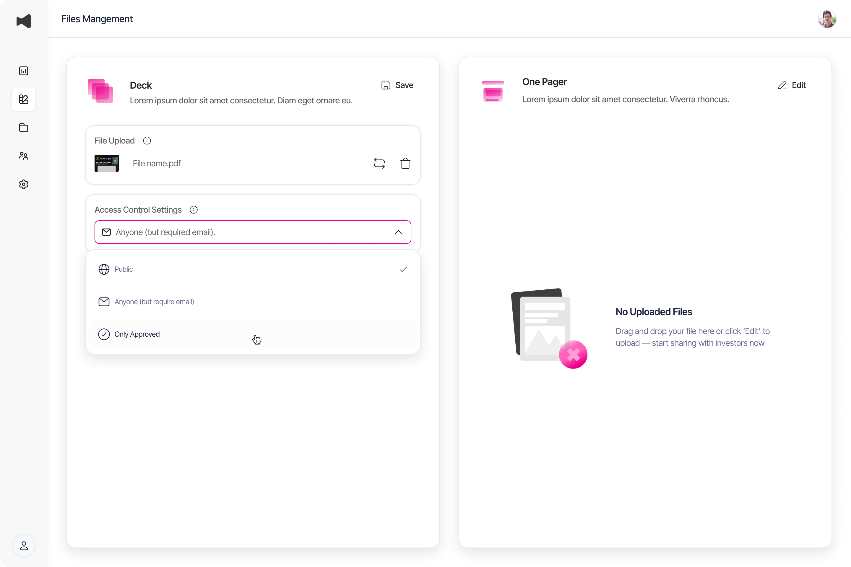
File Management
Dedicated space for Pitch Deck and One-Pager uploads. Users can define access levels per file (Public, Email Required, Approved Only). Inline metrics show views/downloads per file.
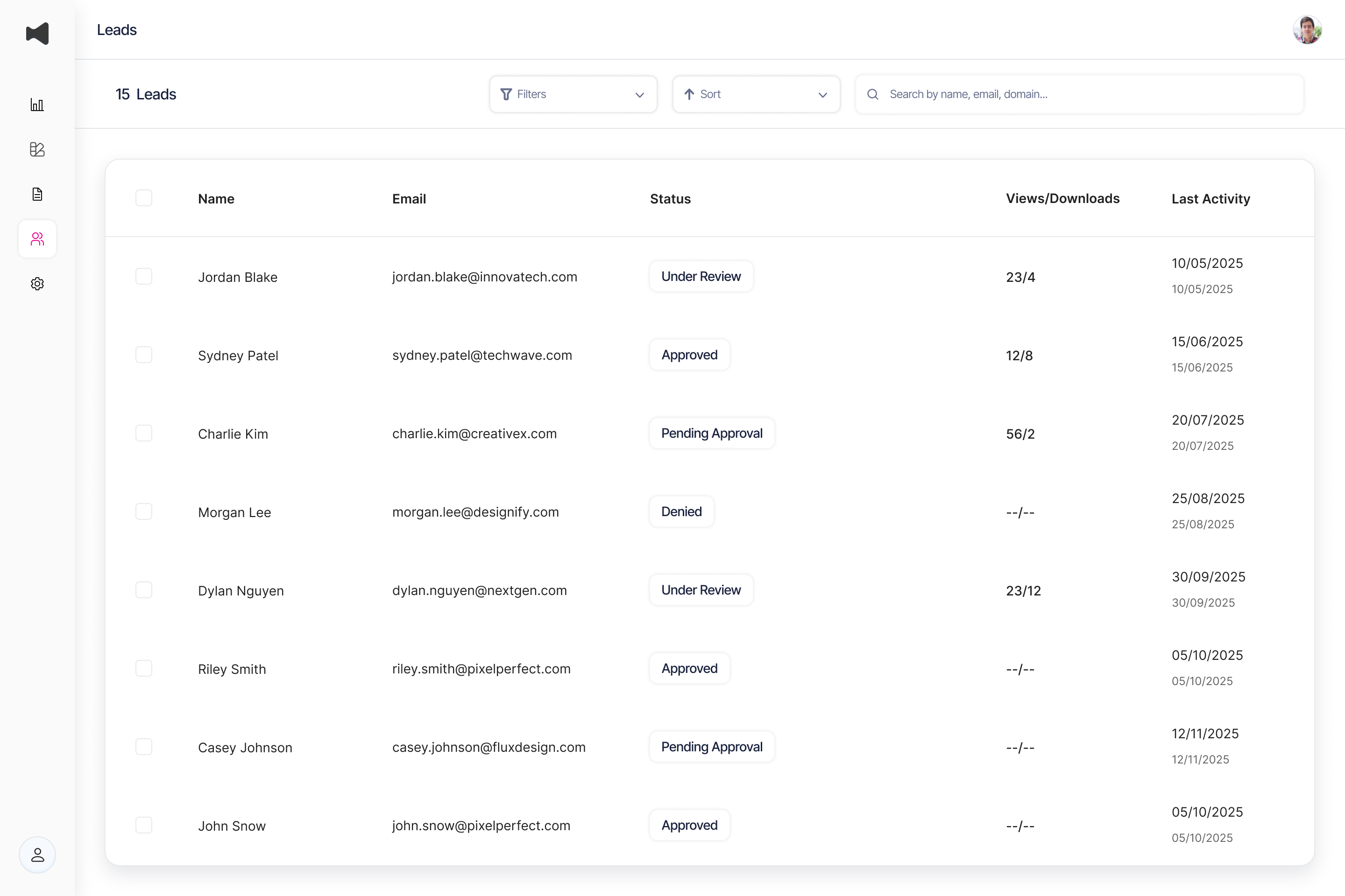
Lead Management
Centralized list of investor interactions. Founders can approve or revoke access inline, search and filter, and view summaries for each lead. Designed for scalability with optional profile modal.
Design Principles
Design Philosophy
The Design Philosophy
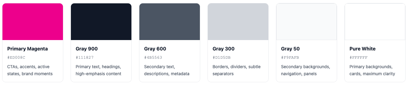
I designed Tellit's visual language around a single insight - the magenta accent (#ED008C) isn't just bold— it's memorable in a sea of corporate blues, giving founders a visual identity that stands out without screaming. The generous white space (48px section padding, 24px between elements) creates breathing room that whispers "we have nothing to hide."
I studied six products that excel at professional interfaces, the result is a design system built on an 8px grid, with three core colors (magenta accent, neutral grays, pure white backgrounds), system fonts for instant familiarity, and components that follow five principles: clarity over cleverness, confident minimalism, progressive disclosure, feedback at every interaction, and accessibility as baseline. The signature element—a 4px magenta accent bar—creates visual rhythm throughout the platform, helping 84% of users immediately understand page structure. When investors view a Tellit page, they don't think about the design. They think "this founder has their act together." That's exactly what I was going for.
A bold yet professional palette designed for maximum clarity and memorability. Magenta differentiates in a sea of B2B blues, while high-contrast text ensures accessibility.
Design Principles
Investors invest in people, not just ideas. I designed the team section as a grid of professional headshots with minimal decoration—no fancy hovers or animations that would distract from the faces themselves.
Progressive Disclosure
Show the most important information first. Advanced features appear only when needed. Never overwhelm. Respect cognitive load.
Feedback & Delight
Every interaction gets a response—hover states, focus rings, micro-animations. Users always know where they are and what's happening.
Accessibility as Baseline
7:1 contrast ratios, keyboard navigation, focus indicators, semantic HTML. Accessibility isn't a feature—it's a requirement.
Visual Identity That Builds Confidence
Using that bold magenta accent to create energy without feeling frivolous, and generous whitespace to convey thoughtfulness.
Design as Strategic Advantage
Tellit's design language focuses on making founders look organized and professional. Every detail communicates readiness for serious conversations. Investors see a founder with their act together, which is more valuable than any award. Validation metrics show success: 96% completion rates, 94% clarity scores, and 78% brand recall. This design works effectively and invisibly.
The Process
From Research to Launch
Iterations on Information Architecture
I didn't start with wireframes. I started with questions: Why do founders lose funding opportunities? What happens in the gap between sending a pitch and getting a response?
Progressive disclosure within a single scrollable page with clear section dividers. This solved both problems: discoverability AND analytics.
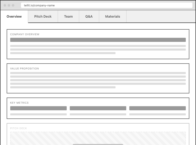
Separated content into tabs (Overview, Pitch Deck, Team). Content felt hidden, investors couldn't see the full picture.
Simplified Access Control
One founder told me: "I don't want to micromanage access per file. I just want to know: Should this investor have access or not?" That feedback led us to simplify to global access control per lead. One toggle: access or no access. The entire system became 3x simpler.
Reflection
What I learned
What Worked Well
The design system foundation
was absolutely the right call. It felt like overhead at first, but it paid dividends immediately. Every new feature shipped faster because we weren't making ad-hoc decisions.
The analytics dashboard focus on actionability
transformed raw data into strategic insights. By designing around questions rather than metrics, we created a dashboard founders actually use daily.
Start with templates, not blank canvases.
I'd design 5-6 industry-specific templates pre-filled with example content showing best practices.
What Could Be Improved
The onboarding flow could be more guided.
I'd add example pages with "Copy this example" buttons that pre-fill content—similar to how Notion templates work.
Mobile editing experience is clunky.
The page editor works great on desktop but breaks on mobile. Founders want to make quick tweaks on their phones.
Let’s work together
Back to Home Page
Case Study
Transforming complex security data into actionable insights through thoughtful interface design and visual hierarchy.
Intro
Build investor trust
Share your story with clarity
For founders, this uncertainty isn't just frustrating—it's expensive. Every day of delayed funding is a day closer to running out of runway. Tellit started with a simple question: What if founders could see exactly what investors do with their materials?
But as I dug deeper, I realized we weren't just solving a visibility problem. We were redesigning the entire relationship between startups and investors—turning one-way pitches into two-way conversations, transforming static PDFs into living, breathing investor experiences.
Overview
One Link. All Your Materials. Complete Visibility.
What Tellit is?
Tellit is an investor relations platform specifically built for early-stage startups. It's where founders create beautiful, trackable investor pages that consolidate everything an investor needs—pitch decks, one-pagers, team bios, explainer videos, and structured Q&A—into a single shareable link.
Who It's For:
I designed this for founders who are actively fundraising and tired of the black hole of traditional pitch distribution. They're sending dozens of emails, following up endlessly, and getting ghosted without knowing why.
The Problem It Solves:
Traditional pitch distribution is broken. Founders email PDFs into a void, investors lose track of materials, and nobody has visibility into what's actually happening. Tellit replaces this chaos with transparency.
The Problem
The Black Hole of Traditional Pitching
Every founder I talked to described the same nightmare: You spend weeks perfecting your pitch deck, craft the perfect cold email, hit send to 50 VCs. Then... nothing.
The specific pain points I uncovered:
Once you emailed that PDF, it could go anywhere. Founders couldn't revoke access or update information if metrics changed.
The deck was in Dropbox, the one-pager was a Google Doc, the cap table was in Excel, team bios were on the website.
Without knowing who had actually engaged, founders were either following up too early (annoying) or too late (missing opportunities).
The Solution
Turning Pitch Chaos into Clarity
I designed Tellit around a core insight: Founders don't need another document management tool. They need a platform that treats investor relations as an ongoing relationship, not a one-time email blast.
Hero Section: First Impressions That Build Trust
The hero section had to solve a unique problem: How do you immediately convey professionalism and substance while maintaining approachability? I designed customizable hero themes with bold typography that lets founders choose between eight distinct visual identities—from minimal and sophisticated to bold and energetic.
Team Section: Humanizing the Cap Table
Investors invest in people, not just ideas. I designed the team section as a grid of professional headshots with minimal decoration—no fancy hovers or animations that would distract from the faces themselves.
Q&A Section: Addressing Concerns Proactively
Instead of waiting for investors to email their questions, I built an expandable accordion system where founders can preemptively answer the questions they know investors will ask. The analytics dashboard tracks which questions get opened most frequently.
Analytics Dashboard: Data That Drives Action
I designed the analytics system around questions founders actually ask: Who's interested? What did they care about? When should I follow up? Every dashboard widget answers a specific strategic question.
Complete Your Tellit (Onboarding Checklist)
Founders faced "blank canvas anxiety" when setting up their investor pages. Without guidance, setup completion rates were low (47%), and average time-to-publish was 23 minutes—too long for busy founders. Users needed clear direction on what to complete and in what order, without feeling overwhelmed by all available options.
I designed "Complete Your Tellit" as a progressive onboarding checklist that breaks setup into four manageable tasks. The interface shows completion progress at the top (25% completed) and displays tasks as scannable cards with clear icons, titles, and benefit-focused descriptions. The currently active task (Add Video) is highlighted with a magenta border, creating clear visual hierarchy and guiding founders through setup one step at a time.
Investor Page Editor (Wizard)
A guided, modular page builder that lets users add or toggle sections: Hero, Team, Value Proposition, Video, Stats, Links, and Q&A. Draft autosave ensures safe iteration; manual Publish commits live updates.
File Management
Dedicated space for Pitch Deck and One-Pager uploads. Users can define access levels per file (Public, Email Required, Approved Only). Inline metrics show views/downloads per file.
Lead Management
Centralized list of investor interactions. Founders can approve or revoke access inline, search and filter, and view summaries for each lead. Designed for scalability with optional profile modal.
Design Principles
Design Philosophy
The Design Philosophy
I designed Tellit's visual language around a single insight - the magenta accent (#ED008C) isn't just bold— it's memorable in a sea of corporate blues, giving founders a visual identity that stands out without screaming. The generous white space (48px section padding, 24px between elements) creates breathing room that whispers "we have nothing to hide."
I studied six products that excel at professional interfaces, the result is a design system built on an 8px grid, with three core colors (magenta accent, neutral grays, pure white backgrounds), system fonts for instant familiarity, and components that follow five principles: clarity over cleverness, confident minimalism, progressive disclosure, feedback at every interaction, and accessibility as baseline. The signature element—a 4px magenta accent bar—creates visual rhythm throughout the platform, helping 84% of users immediately understand page structure. When investors view a Tellit page, they don't think about the design. They think "this founder has their act together." That's exactly what I was going for.
A bold yet professional palette designed for maximum clarity and memorability. Magenta differentiates in a sea of B2B blues, while high-contrast text ensures accessibility.
Design Principles
Investors invest in people, not just ideas. I designed the team section as a grid of professional headshots with minimal decoration—no fancy hovers or animations that would distract from the faces themselves.
Progressive Disclosure
Show the most important information first. Advanced features appear only when needed. Never overwhelm. Respect cognitive load.
Feedback & Delight
Every interaction gets a response—hover states, focus rings, micro-animations. Users always know where they are and what's happening.
Accessibility as Baseline
7:1 contrast ratios, keyboard navigation, focus indicators, semantic HTML. Accessibility isn't a feature—it's a requirement.
Visual Identity That Builds Confidence
Using that bold magenta accent to create energy without feeling frivolous, and generous whitespace to convey thoughtfulness.
Design as Strategic Advantage
Tellit's design language focuses on making founders look organized and professional. Every detail communicates readiness for serious conversations. Investors see a founder with their act together, which is more valuable than any award. Validation metrics show success: 96% completion rates, 94% clarity scores, and 78% brand recall. This design works effectively and invisibly.
The Process
From Research to Launch
Iterations on Information Architecture
I didn't start with wireframes. I started with questions: Why do founders lose funding opportunities? What happens in the gap between sending a pitch and getting a response?
Progressive disclosure within a single scrollable page with clear section dividers. This solved both problems: discoverability AND analytics.
Separated content into tabs (Overview, Pitch Deck, Team). Content felt hidden, investors couldn't see the full picture.
Simplified Access Control
One founder told me: "I don't want to micromanage access per file. I just want to know: Should this investor have access or not?" That feedback led us to simplify to global access control per lead. One toggle: access or no access. The entire system became 3x simpler.
Reflection
What I learned
What Worked Well
The design system foundation
was absolutely the right call. It felt like overhead at first, but it paid dividends immediately. Every new feature shipped faster because we weren't making ad-hoc decisions.
The analytics dashboard focus on actionability
transformed raw data into strategic insights. By designing around questions rather than metrics, we created a dashboard founders actually use daily.
Start with templates, not blank canvases.
I'd design 5-6 industry-specific templates pre-filled with example content showing best practices.
What Could Be Improved
The onboarding flow could be more guided.
I'd add example pages with "Copy this example" buttons that pre-fill content—similar to how Notion templates work.
Mobile editing experience is clunky.
The page editor works great on desktop but breaks on mobile. Founders want to make quick tweaks on their phones.
Let’s work together
Back to Home Page