
Case Study
Raven - Security Intelligence Platform
Transforming overwhelming security data into actionable intelligence for cloud security teams
Intro
Raven is a security intelligence platform designed for threat analysis and incident response. The platform enables security teams to aggregate, correlate, and analyze data from multiple sources to identify patterns, investigate threats, and respond to security incidents in real-time.
My focus was designing an interface that could handle massive data volumes while remaining scannable and actionable. This meant rethinking how we organize, prioritize, and visualize security information to match analyst mental models and workflows.
Part 1
The Challenge
Understanding Our Users
I started by shadowing security analysts to understand their daily workflow. What I discovered was fascinating: these are expert users who spend 8-10 hours a day in security tools, making hundreds of decisions about potential threats.
Key Insights from User research
→
Information Overload
Analysts receive thousands of security alerts daily. Without proper filtering, they couldn't distinguish critical issues from noise
→
Context Switching
Existing tools forced analysts to jump between 5-6 different screens to understand a single security issue. This broke their flow and slowed response time
→
Lack Of Visual Hierarchy
Everything looked equally important, making it impossible to quickly scan and prioritize
→
Cognitive Overload
Dense tables with 15+ columns felt overwhelming, even though analysts needed all that information
The core UX challenge:
How do you design for expert users who need to see vast amounts of data, but also need to make split-second decisions about what requires immediate attention?
Part 2
The Solution
Design Principles from User Research
I approached this by establishing a clear visual hierarchy that mirrors how security analysts think: start broad, drill into specifics, and always maintain context about where you are in the system.
1. Progressive Disclosure Through Focused Zones
Rather than showing everything at once, I organized information into "focus zones" based on risk and execution status—what's running in production vs. what's loaded vs. what's simply present in the codebase. This alone reduces cognitive load by 80%.
2. Color as a Language, Not Decoration
I built a systematic color vocabulary where every hue carries specific meaning:
Critical
High
Medium
Low
3. Reduce Context Switching
Instead of forcing users to jump between screens, I brought all related information into contextual panels. One view should tell the complete story.
Dashboard: The 30-Second Security Snapshot
User need:
"When I open the tool each morning, I need to know immediately: What needs my attention today?"
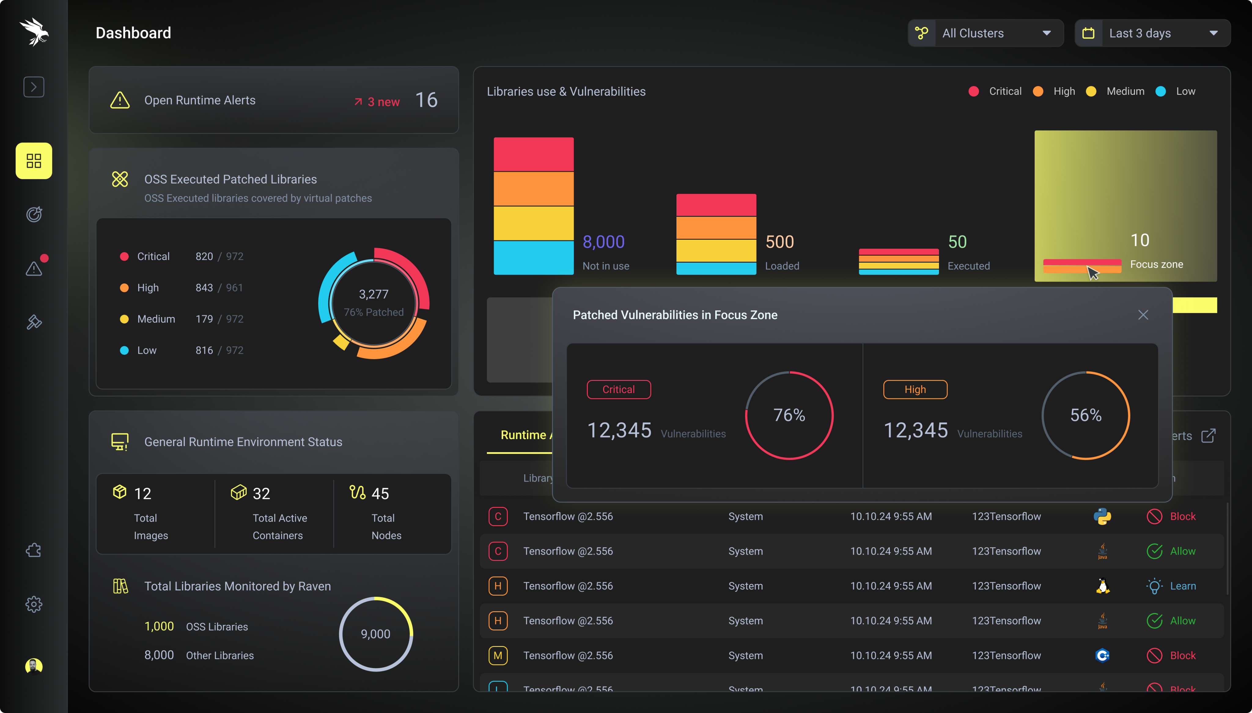
The dashboard is designed to answer one question immediately:
“What needs my attention right now?”
Key Design Decisions
→
Visual hierarchy through position and size
I placed the most urgent information at the top-left (active alerts with trend indicators). This matches natural reading patterns and grabs attention immediately.
→
Reducing cognitive load with "glanceable" metrics
Instead of raw numbers, I used donut charts, stacked bar charts, flow visualizations, and delta indicators (↗ 3 new) to communicate at a glance.
→
Creating clear entry points
The dashboard doesn't just show data—it provides clear next actions. Each section has a direct path to more details.
Why this works:
The dashboard doesn't try to show everything. It shows severity, trends, and entry points to deeper investigation. An analyst can walk into work, glance at this screen, and know exactly where to focus their day.
Vulnerability Management - Organizing Threats by Repository
User need:
"I need to scan hundreds of security issues and quickly identify which ones are actually dangerous."
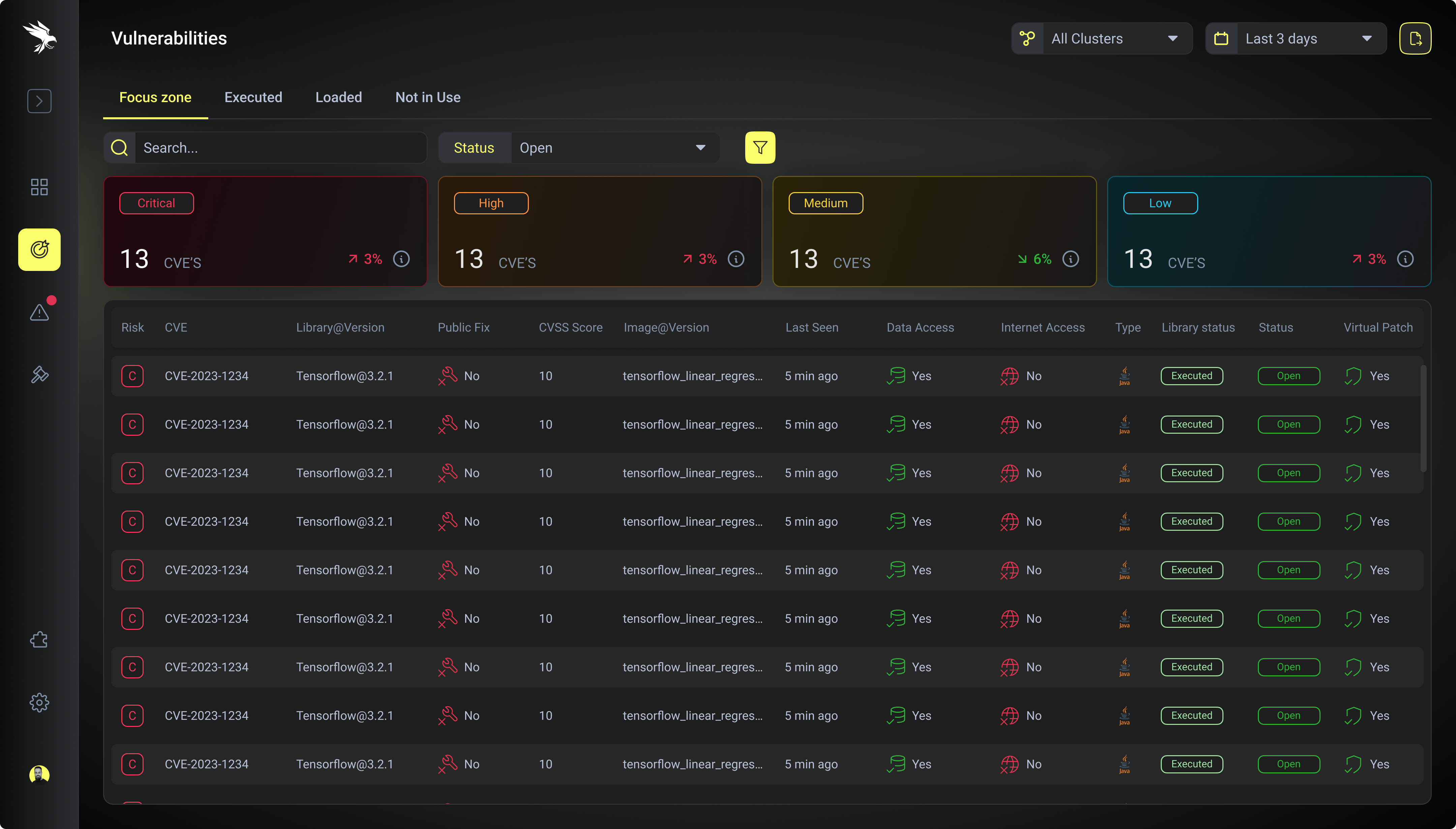
This was the most challenging screen because analysts told me they needed to see everything, but looking at "everything" was overwhelming. The breakthrough came from understanding their triage process.
Information architecture insight:
Analysts think in buckets: "What's actively dangerous?" → "What could become dangerous?" → "What's just noise?" Instead of showing one massive list, I created tabs that match this mental model:
Each tab shows aggregate counts by severity with trend indicators. The table below reveals 12 critical attributes per vulnerability: Risk level, CVE identifier, Library@Version, Public Fix availability, CVSS Score, Image@Version, Last Seen timestamp, Data Access status, Internet Access status, Type icon, Library Status, and Virtual Patch availability.
Design Decisions
→
Severity badges
use high-contrast outlined styles against the dark background—critical is unmissable
→
Status indicators
use icons with consistent patterns: ✅ Yes (green), ❌ No (red), 🔄 shield icons for patches
→
Truncated text
with ellipsis on long library names keeps the table scannable, with tooltips on hover
→
"Open" status pills
use subtle green with low opacity to indicate resolved states without competing for attention
→
Filter and search
are persistent at the top, acknowledging that analysts rarely view the entire dataset raw
Why this works:
The tabs create natural triage buckets. Security teams can focus first on "Focus zone" (executed critical vulnerabilities), then work down the priority list. The color system makes critical items literally impossible to miss.
Detail Panel - Details without Context Switching
User need:
"When I click on an issue, I need to see everything related to it without opening new tabs."
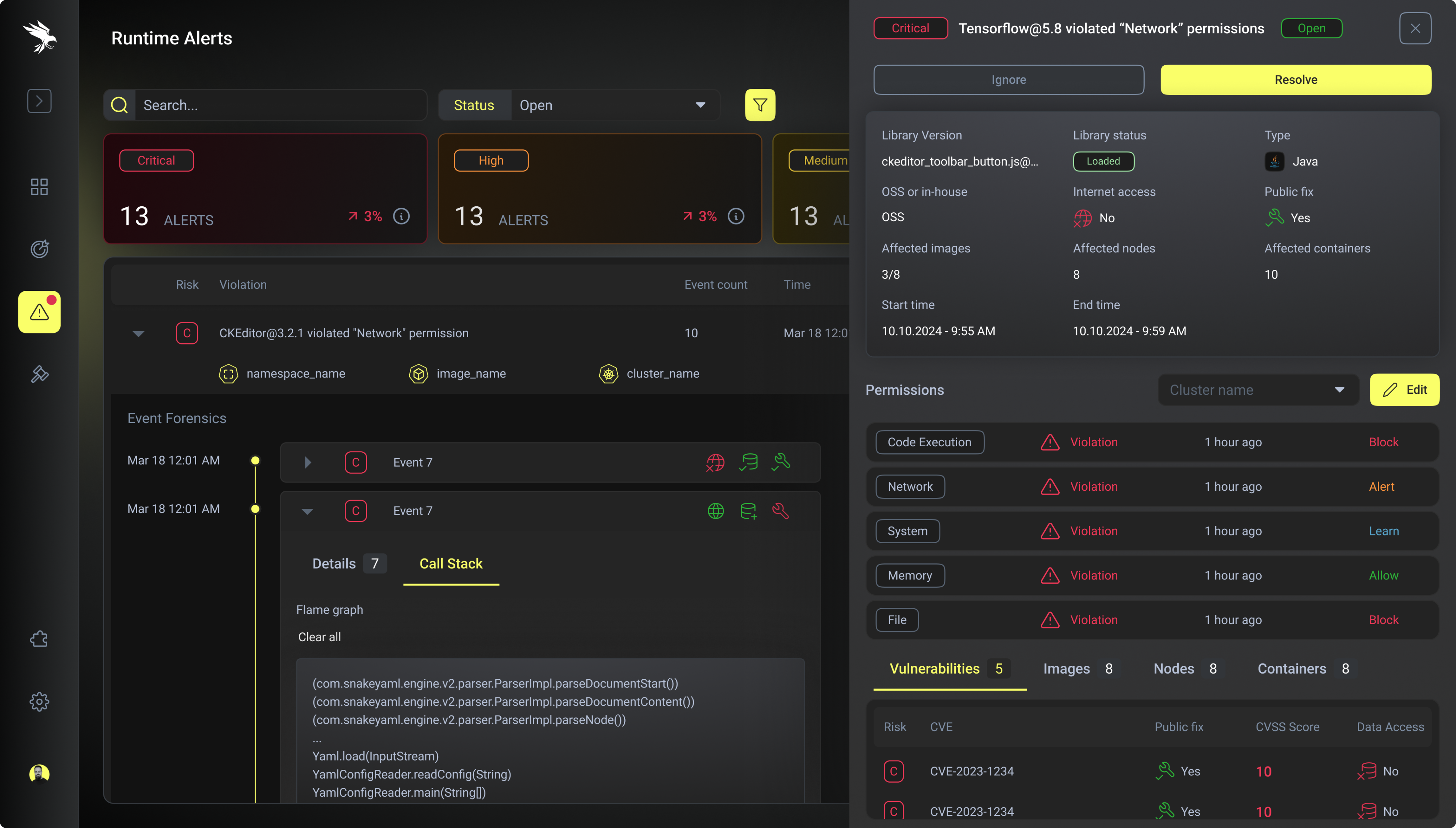
Repository-based vulnerability view with severity indicators (Critical, Medium, High) and detailed CVE information, allowing analysts to quickly assess risk levels and access remediation guidance.
Repository-based vulnerability view with severity indicators (Critical, Medium, High) and detailed CVE information, allowing analysts to quickly assess risk levels and access remediation guidance.
UX solution: Contextual slide-in panel
Instead of navigating to a new page, clicking an issue opens a detailed panel from the right side of the screen. The list stays visible behind it, so users never lose context.
Why this works:
The detail panel doesn't hide complexity—it organizes it. Analysts can quickly validate the threat, understand the blast radius, and take action in a single view.
Part 3
Design System: Creating Visual Consistency
A Hierarchy-First Approach to Complex Data
The design system emphasizes hierarchy through strategic use of color—critical alerts in red, warnings in amber, and healthy states in cyan. Each dashboard view was crafted to answer specific questions security teams ask daily: What needs immediate attention? Where are we vulnerable? How are we trending?
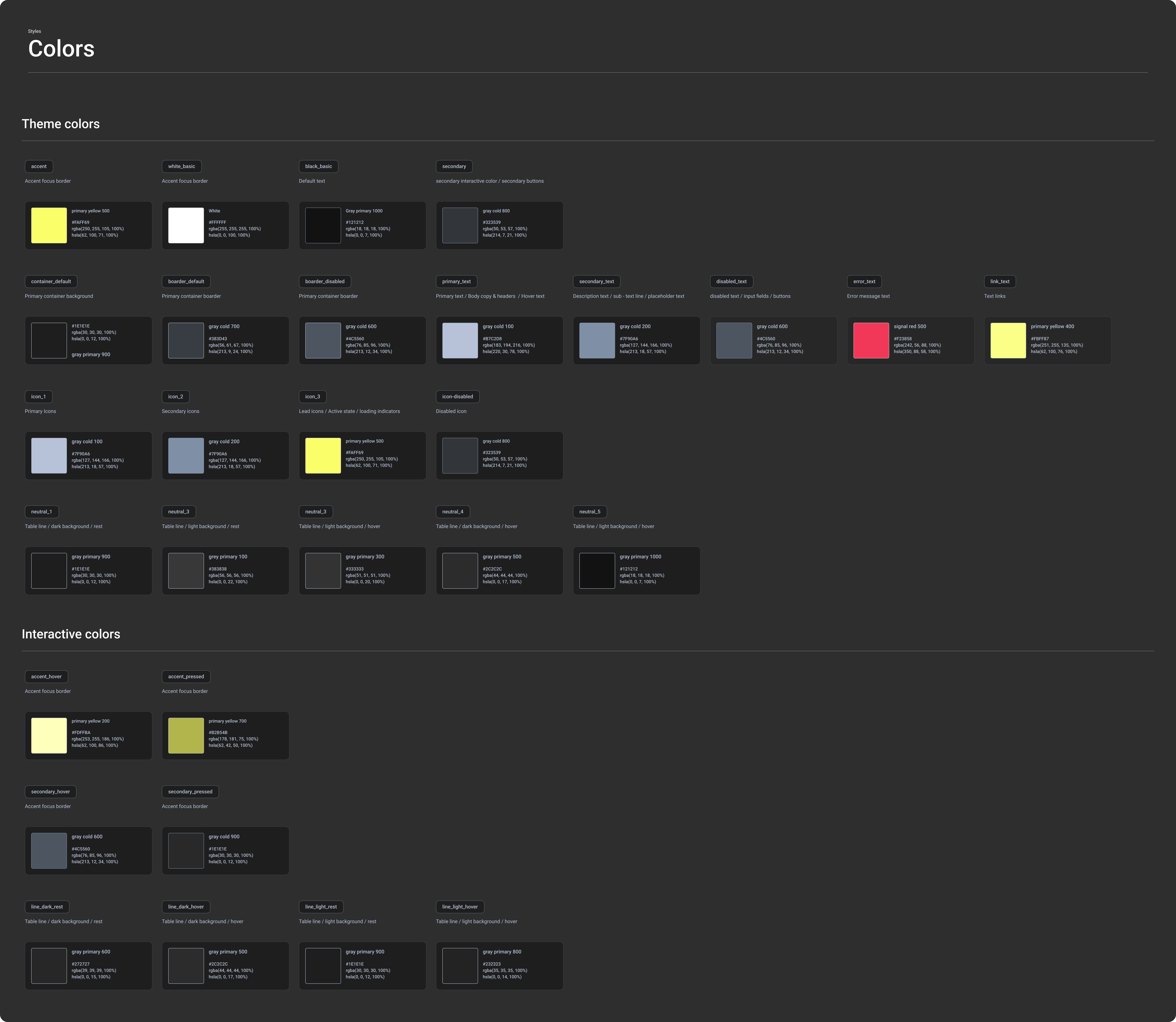
Component Library
I created a comprehensive button system with multiple variants (primary, secondary, tertiary, icon-only) and states (default, hover, active, disabled). This ensured interaction patterns felt consistent across every screen, reducing cognitive load as users navigated the app.
Part 4
Process & Learnings
Research Phase: Understanding Expert Users
User shadowing (Week 1-2)
I spent two weeks shadowing three security analysts to understand their actual workflow. I watched them triage alerts, investigate issues, and coordinate with their teams. This hands-on observation revealed patterns the stakeholders hadn't mentioned.
Key discovery:
Analysts have a very specific scan pattern. They scan top-to-bottom, left-to-right, looking for color first, then numbers, then text. This insight shaped every layout decision I made.
Competitive analysis
I audited similar security tools to understand industry patterns and identify opportunities to differentiate. Most tools fell into two camps: overly simplified (hiding necessary details) or overwhelming (showing everything at once with no hierarchy).
Design Phase: Iterating on Solutions
Low-fidelity explorations (Week 3-4)
I started with rough wireframes testing different information architectures. I explored single-page dashboard vs. tab-based navigation, card layouts vs. table layouts, and full-page detail views vs. slide-in panels.
Early user feedback (Week 5)
I showed low-fidelity wireframes to 5 analysts. The biggest insight: they wanted density, not simplicity. My initial designs tried to hide complexity, but analysts said "I need to see all of this at once."
High-fidelity prototypes (Week 6-8)
I built interactive prototypes in Figma focusing on three key flows: morning triage, threat investigation, and team communication. This let me test interaction patterns before committing to development.
Part 5
Impact & Results
Improving the User Experience
While the project is ongoing, early testing and beta user feedback shows significant UX improvements:
Let’s work together
Case Study
Raven - Security Intelligence Platform
Transforming overwhelming security data into actionable intelligence for cloud security teams
Intro
Raven is a security intelligence platform designed for threat analysis and incident response. The platform enables security teams to aggregate, correlate, and analyze data from multiple sources to identify patterns, investigate threats, and respond to security incidents in real-time.
My focus was designing an interface that could handle massive data volumes while remaining scannable and actionable. This meant rethinking how we organize, prioritize, and visualize security information to match analyst mental models and workflows.
Part 1
The Challenge
Understanding Our Users
I started by shadowing security analysts to understand their daily workflow. What I discovered was fascinating: these are expert users who spend 8-10 hours a day in security tools, making hundreds of decisions about potential threats.
Key Insights from User research
→
Information Overload
Analysts receive thousands of security alerts daily. Without proper filtering, they couldn't distinguish critical issues from noise
→
Context Switching
Existing tools forced analysts to jump between 5-6 different screens to understand a single security issue. This broke their flow and slowed response time
→
Lack Of Visual Hierarchy
Everything looked equally important, making it impossible to quickly scan and prioritize
→
Cognitive Overload
Dense tables with 15+ columns felt overwhelming, even though analysts needed all that information
The core UX challenge:
How do you design for expert users who need to see vast amounts of data, but also need to make split-second decisions about what requires immediate attention?
Part 2
The Solution
Design Principles from User Research
I approached this by establishing a clear visual hierarchy that mirrors how security analysts think: start broad, drill into specifics, and always maintain context about where you are in the system.
1. Progressive Disclosure Through Focused Zones
Rather than showing everything at once, I organized information into "focus zones" based on risk and execution status—what's running in production vs. what's loaded vs. what's simply present in the codebase. This alone reduces cognitive load by 80%.
2. Color as a Language, Not Decoration
I built a systematic color vocabulary where every hue carries specific meaning:
Critical
High
Medium
Low
3. Reduce Context Switching
Instead of forcing users to jump between screens, I brought all related information into contextual panels. One view should tell the complete story.
Dashboard: The 30-Second Security Snapshot
User need:
"When I open the tool each morning, I need to know immediately: What needs my attention today?"
The dashboard is designed to answer one question immediately:
“What needs my attention right now?”
Key Design Decisions
→
Visual hierarchy through position and size
I placed the most urgent information at the top-left (active alerts with trend indicators). This matches natural reading patterns and grabs attention immediately.
→
Reducing cognitive load with "glanceable" metrics
Instead of raw numbers, I used donut charts, stacked bar charts, flow visualizations, and delta indicators (↗ 3 new) to communicate at a glance.
→
Creating clear entry points
The dashboard doesn't just show data—it provides clear next actions. Each section has a direct path to more details.
Why this works:
The dashboard doesn't try to show everything. It shows severity, trends, and entry points to deeper investigation. An analyst can walk into work, glance at this screen, and know exactly where to focus their day.
Vulnerability Management - Organizing Threats by Repository
User need:
"I need to scan hundreds of security issues and quickly identify which ones are actually dangerous."
This was the most challenging screen because analysts told me they needed to see everything, but looking at "everything" was overwhelming. The breakthrough came from understanding their triage process.
Information architecture insight:
Analysts think in buckets: "What's actively dangerous?" → "What could become dangerous?" → "What's just noise?" Instead of showing one massive list, I created tabs that match this mental model:
Each tab shows aggregate counts by severity with trend indicators. The table below reveals 12 critical attributes per vulnerability: Risk level, CVE identifier, Library@Version, Public Fix availability, CVSS Score, Image@Version, Last Seen timestamp, Data Access status, Internet Access status, Type icon, Library Status, and Virtual Patch availability.
Design Decisions
→
Severity badges
use high-contrast outlined styles against the dark background—critical is unmissable
→
Status indicators
use icons with consistent patterns: ✅ Yes (green), ❌ No (red), 🔄 shield icons for patches
→
Truncated text
with ellipsis on long library names keeps the table scannable, with tooltips on hover
→
"Open" status pills
use subtle green with low opacity to indicate resolved states without competing for attention
→
Filter and search
are persistent at the top, acknowledging that analysts rarely view the entire dataset raw
Why this works:
The tabs create natural triage buckets. Security teams can focus first on "Focus zone" (executed critical vulnerabilities), then work down the priority list. The color system makes critical items literally impossible to miss.
Detail Panel - Details without Context Switching
User need:
"When I click on an issue, I need to see everything related to it without opening new tabs."
Repository-based vulnerability view with severity indicators (Critical, Medium, High) and detailed CVE information, allowing analysts to quickly assess risk levels and access remediation guidance.
Repository-based vulnerability view with severity indicators (Critical, Medium, High) and detailed CVE information, allowing analysts to quickly assess risk levels and access remediation guidance.
UX solution: Contextual slide-in panel
Instead of navigating to a new page, clicking an issue opens a detailed panel from the right side of the screen. The list stays visible behind it, so users never lose context.
Why this works:
The detail panel doesn't hide complexity—it organizes it. Analysts can quickly validate the threat, understand the blast radius, and take action in a single view.
Part 3
Design System: Creating Visual Consistency
A Hierarchy-First Approach to Complex Data
The design system emphasizes hierarchy through strategic use of color—critical alerts in red, warnings in amber, and healthy states in cyan. Each dashboard view was crafted to answer specific questions security teams ask daily: What needs immediate attention? Where are we vulnerable? How are we trending?
Component Library
I created a comprehensive button system with multiple variants (primary, secondary, tertiary, icon-only) and states (default, hover, active, disabled). This ensured interaction patterns felt consistent across every screen, reducing cognitive load as users navigated the app.
Part 4
Process & Learnings
Research Phase: Understanding Expert Users
User shadowing (Week 1-2)
I spent two weeks shadowing three security analysts to understand their actual workflow. I watched them triage alerts, investigate issues, and coordinate with their teams. This hands-on observation revealed patterns the stakeholders hadn't mentioned.
Key discovery:
Analysts have a very specific scan pattern. They scan top-to-bottom, left-to-right, looking for color first, then numbers, then text. This insight shaped every layout decision I made.
Competitive analysis
I audited similar security tools to understand industry patterns and identify opportunities to differentiate. Most tools fell into two camps: overly simplified (hiding necessary details) or overwhelming (showing everything at once with no hierarchy).
Design Phase: Iterating on Solutions
Low-fidelity explorations (Week 3-4)
I started with rough wireframes testing different information architectures. I explored single-page dashboard vs. tab-based navigation, card layouts vs. table layouts, and full-page detail views vs. slide-in panels.
Early user feedback (Week 5)
I showed low-fidelity wireframes to 5 analysts. The biggest insight: they wanted density, not simplicity. My initial designs tried to hide complexity, but analysts said "I need to see all of this at once."
High-fidelity prototypes (Week 6-8)
I built interactive prototypes in Figma focusing on three key flows: morning triage, threat investigation, and team communication. This let me test interaction patterns before committing to development.
Part 5
Impact & Results
Improving the User Experience
While the project is ongoing, early testing and beta user feedback shows significant UX improvements:
Let’s work together