
Case Study
Adaptive Shield — Cybersecurity Management Platform
Transforming complex security data into actionable insights through thoughtful interface design and visual hierarchy.
Intro
Adaptive Shield is a comprehensive cybersecurity management platform that helps security teams monitor, analyze, and respond to threats across their entire technology stack. The platform consolidates data from multiple security tools into a unified dashboard, enabling teams to maintain visibility and control over their security posture.
Part 1
The Challenge
Why we built it?
Security teams were drowning in fragmented data across multiple tools, making it nearly impossible to get a comprehensive view of their security posture. The challenge was to create a unified platform that could synthesize complex security data into actionable insights without overwhelming users.
Part 2
The Design System
How we built it?
I designed a comprehensive dashboard system that transforms dense security metrics into clear, scannable visualizations. The interface prioritizes critical alerts while maintaining deep-dive capabilities for technical analysis. Key features include real-time threat monitoring, automated compliance tracking, and customizable alert systems.
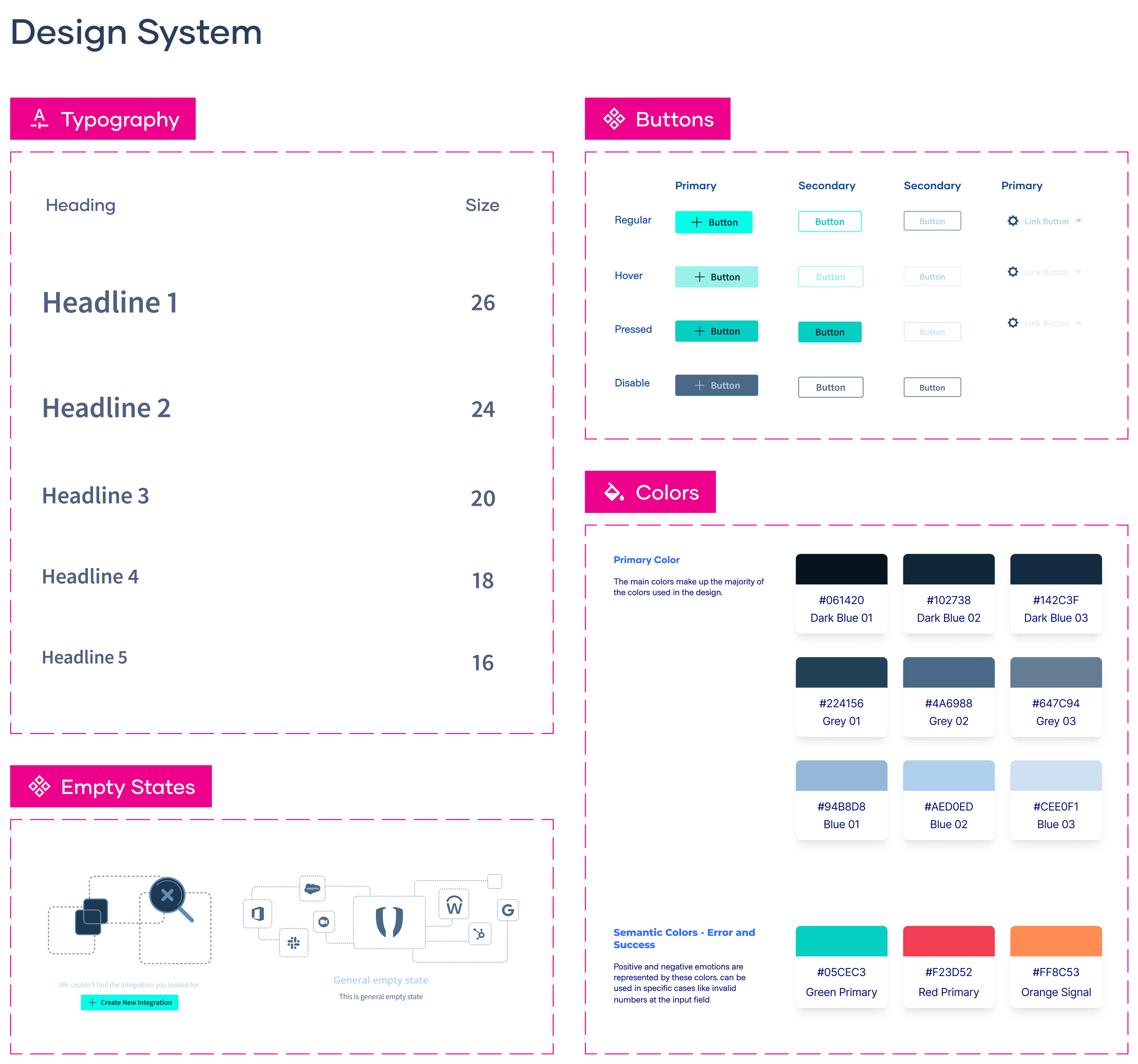
The design system emphasizes hierarchy through strategic use of color—critical alerts in red, warnings in amber, and healthy states in cyan. Each dashboard view was crafted to answer specific questions security teams ask daily: What needs immediate attention? Where are we vulnerable? How are we trending?
Part 3
The Solution
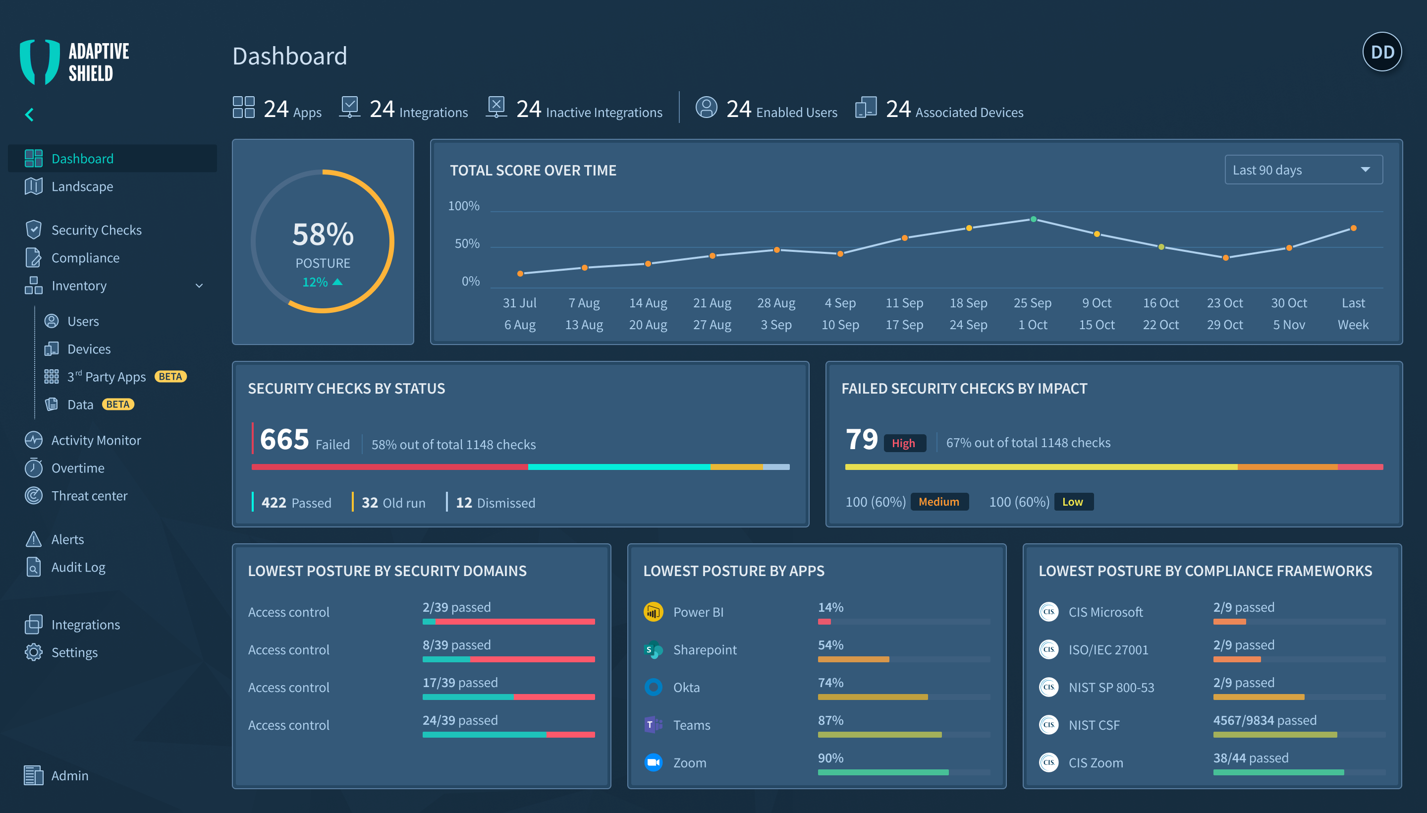
Dashboard Overview
I designed a comprehensive dashboard system that transforms dense security metrics into clear, scannable visualizations. The interface prioritizes critical alerts while maintaining deep-dive capabilities for technical analysis. Key features include real-time threat monitoring, automated compliance tracking, and customizable alert systems.
Dashboard interface demonstrating cognitive efficiency through strategic information hierarchy and visual anchoring
This dashboard demonstrates how interface design can transform overwhelming security data into decision-ready information. The UI architecture prioritizes cognitive efficiency—every element is positioned to minimize mental effort while maximizing information transfer. The circular progress indicator at 58% becomes the visual anchor, with surrounding cards providing supporting context in predictable locations. This creates a scannable hierarchy where analysts can check system health in seconds, then drill deeper only when needed. The interface succeeds not by showing everything, but by showing the right things in the right order, turning complexity into clarity through thoughtful information architecture and visual restraint.
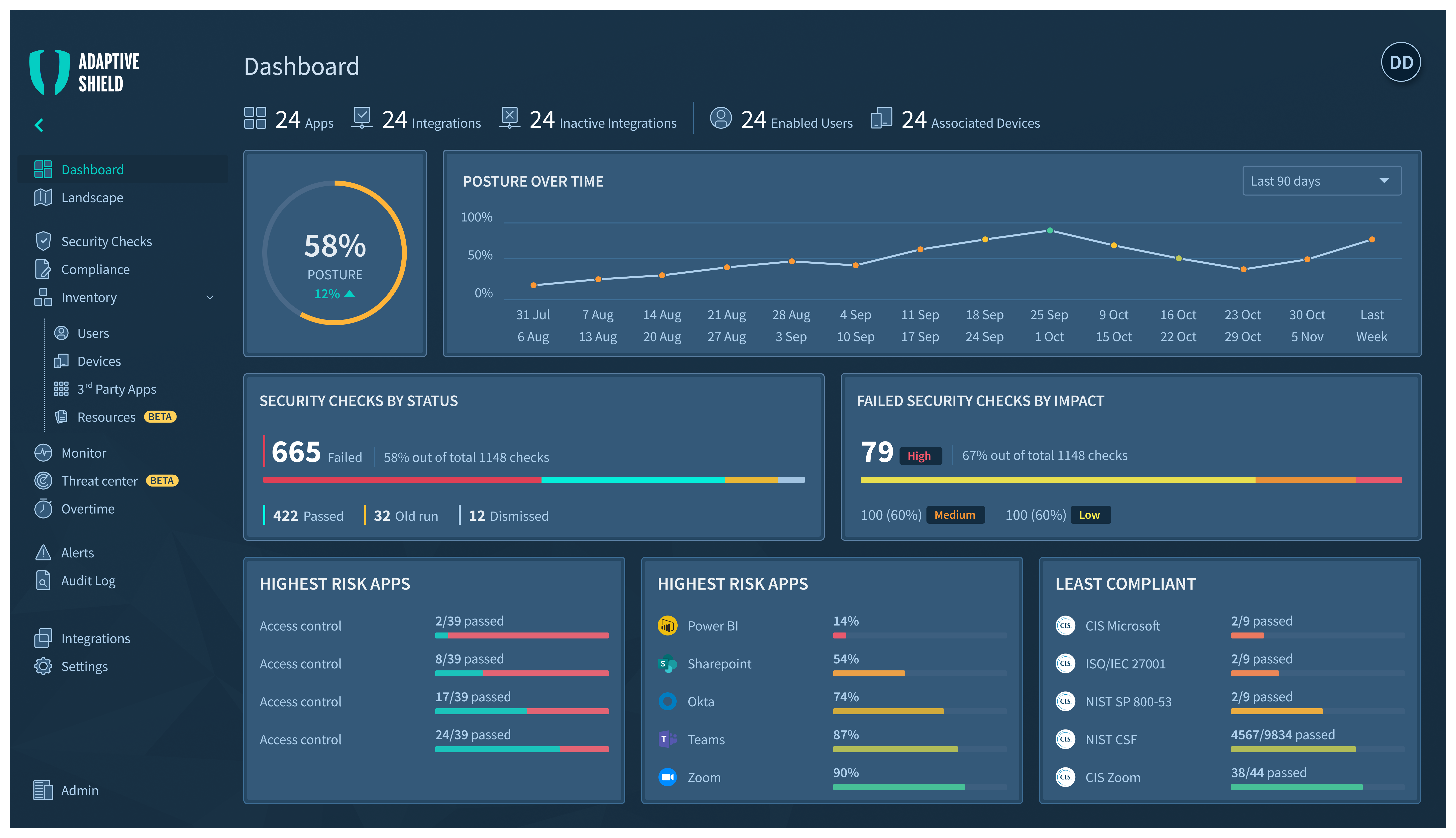
Security Checks
This screen consolidates numerous security checks into a unified view, with a strong emphasis on compliance status and remediation actions.
The Security Checks dashboard provides a detailed, drill-down view. A master list of checks is paired with a focused detail panel, allowing analysts to review specifics and take action without losing context.
Key UI Decisions
Master-Detail Layout:
The screen is split between a comprehensive list of all security checks and a dynamic detail panel. This allows users to browse and select an item while viewing its full context and taking action—all without navigation.
Activity Monitor - Tracking User Actions and System Changes.
The Activity Monitor provides comprehensive visibility into all user actions and system configuration changes, serving as a critical audit trail for security investigations and compliance reporting.
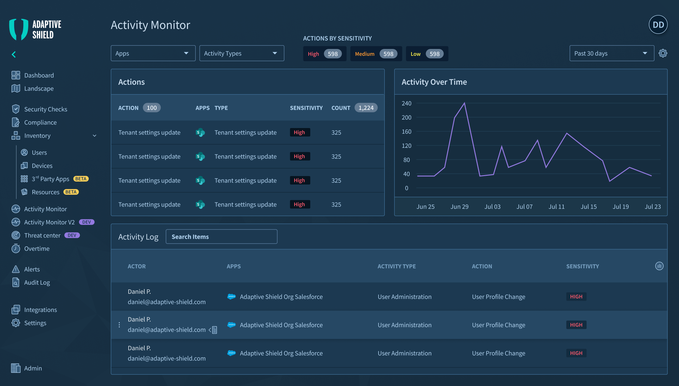
The Activity Monitor features a dual-panel layout with summary statistics above a detailed activity log, enabling both high-level trend analysis and granular incident investigation.
Key UI Decisions
Dual-Layer Information Architecture:
Summary panel aggregates action frequencies and sensitivity levels, while the detailed log provides complete context—enabling analysts to spot trends, then drill into specific incidents.
This layout addresses the forensic workflow of security teams—starting with anomalous patterns in the summary view, then filtering the detailed log for specific instances. Sensitivity classifications use standardized codes rather than color-only indicators, ensuring clarity in printed reports and for colorblind users.
The Landscape View - Scaling to Show System Relationships
This view scales the platform's capabilities to visualize relationships and health across multiple security domains and applications simultaneously.
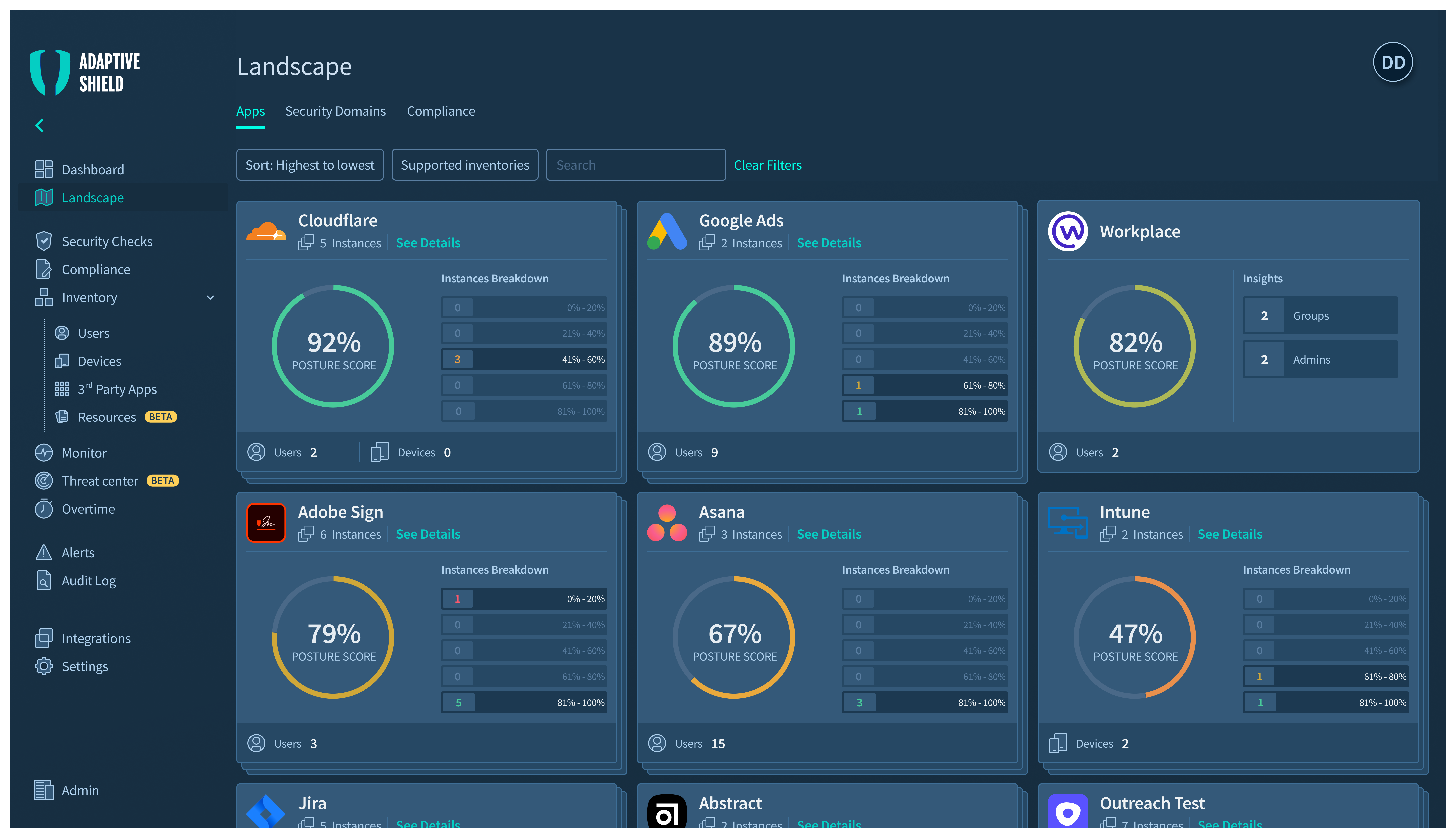
The Landscape view uses a consistent grid of gauge-based cards to provide a comparable, at-a-glance health status across all integrated apps and services.
Key UI Decisions
Consistent Gauge System:
Multiple circular gauges use a universal green-to-red spectrum, leveraging existing mental models (like traffic lights) to communicate status instantly without requiring conscious thought.
This layout addresses the forensic workflow of security teams—starting with anomalous patterns in the summary view, then filtering the detailed log for specific instances. Sensitivity classifications use standardized codes rather than color-only indicators, ensuring clarity in printed reports and for colorblind users.
Conclusion
The Adaptive Shield project demonstrates how deliberate UI design can tame extreme complexity. By focusing on cognitive load, leveraging universal visual patterns, and building a consistent, accessible design system, the interface empowers security analysts to work faster, with more confidence, and less fatigue. The result is a platform that doesn't just present data—it facilitates understanding and drives action.
Let’s work together
Case Study
Adaptive Shield — Cybersecurity Management Platform
Transforming complex security data into actionable insights through thoughtful interface design and visual hierarchy.
Intro
Adaptive Shield is a comprehensive cybersecurity management platform that helps security teams monitor, analyze, and respond to threats across their entire technology stack. The platform consolidates data from multiple security tools into a unified dashboard, enabling teams to maintain visibility and control over their security posture.
Part 1
The Challenge
Why we built it?
Security teams were drowning in fragmented data across multiple tools, making it nearly impossible to get a comprehensive view of their security posture. The challenge was to create a unified platform that could synthesize complex security data into actionable insights without overwhelming users.
Part 2
The Design System
How we built it?
I designed a comprehensive dashboard system that transforms dense security metrics into clear, scannable visualizations. The interface prioritizes critical alerts while maintaining deep-dive capabilities for technical analysis. Key features include real-time threat monitoring, automated compliance tracking, and customizable alert systems.
The design system emphasizes hierarchy through strategic use of color—critical alerts in red, warnings in amber, and healthy states in cyan. Each dashboard view was crafted to answer specific questions security teams ask daily: What needs immediate attention? Where are we vulnerable? How are we trending?
Part 3
The Solution
Dashboard Overview
I designed a comprehensive dashboard system that transforms dense security metrics into clear, scannable visualizations. The interface prioritizes critical alerts while maintaining deep-dive capabilities for technical analysis. Key features include real-time threat monitoring, automated compliance tracking, and customizable alert systems.
Dashboard interface demonstrating cognitive efficiency through strategic information hierarchy and visual anchoring
This dashboard demonstrates how interface design can transform overwhelming security data into decision-ready information. The UI architecture prioritizes cognitive efficiency—every element is positioned to minimize mental effort while maximizing information transfer. The circular progress indicator at 58% becomes the visual anchor, with surrounding cards providing supporting context in predictable locations. This creates a scannable hierarchy where analysts can check system health in seconds, then drill deeper only when needed. The interface succeeds not by showing everything, but by showing the right things in the right order, turning complexity into clarity through thoughtful information architecture and visual restraint.
Security Checks
This screen consolidates numerous security checks into a unified view, with a strong emphasis on compliance status and remediation actions.
The Security Checks dashboard provides a detailed, drill-down view. A master list of checks is paired with a focused detail panel, allowing analysts to review specifics and take action without losing context.
Key UI Decisions
Master-Detail Layout:
The screen is split between a comprehensive list of all security checks and a dynamic detail panel. This allows users to browse and select an item while viewing its full context and taking action—all without navigation.
Activity Monitor - Tracking User Actions and System Changes.
The Activity Monitor provides comprehensive visibility into all user actions and system configuration changes, serving as a critical audit trail for security investigations and compliance reporting.
The Activity Monitor features a dual-panel layout with summary statistics above a detailed activity log, enabling both high-level trend analysis and granular incident investigation.
Key UI Decisions
Dual-Layer Information Architecture:
Summary panel aggregates action frequencies and sensitivity levels, while the detailed log provides complete context—enabling analysts to spot trends, then drill into specific incidents.
This layout addresses the forensic workflow of security teams—starting with anomalous patterns in the summary view, then filtering the detailed log for specific instances. Sensitivity classifications use standardized codes rather than color-only indicators, ensuring clarity in printed reports and for colorblind users.
The Landscape View - Scaling to Show System Relationships
This view scales the platform's capabilities to visualize relationships and health across multiple security domains and applications simultaneously.
The Landscape view uses a consistent grid of gauge-based cards to provide a comparable, at-a-glance health status across all integrated apps and services.
Key UI Decisions
Consistent Gauge System:
Multiple circular gauges use a universal green-to-red spectrum, leveraging existing mental models (like traffic lights) to communicate status instantly without requiring conscious thought.
This layout addresses the forensic workflow of security teams—starting with anomalous patterns in the summary view, then filtering the detailed log for specific instances. Sensitivity classifications use standardized codes rather than color-only indicators, ensuring clarity in printed reports and for colorblind users.
Conclusion
The Adaptive Shield project demonstrates how deliberate UI design can tame extreme complexity. By focusing on cognitive load, leveraging universal visual patterns, and building a consistent, accessible design system, the interface empowers security analysts to work faster, with more confidence, and less fatigue. The result is a platform that doesn't just present data—it facilitates understanding and drives action.
Let’s work together