
Case Study
Making Security Compliance Easy
How we redesigned the way security teams track compliance violations across standards like PCI-DSS, HIPAA, and more.
Intro
As the Product Designer, I led the development of an innovative compliance management solution. Working with product managers and developers through multiple design sprints, we shipped a comprehensive dashboard experience over three months.
Part 1
The Challenge
Why we built it?
Our legacy dashboard surfaced violations, but it was fragmented across reports, lacking any spatial hierarchy. There was no way to see how one standard fared across apps, or how one app violated different controls. Security teams were wasting hours in spreadsheets trying to decode compliance posture.
So we reframed the problem.
What if compliance data worked like a heatmap?
We followed a structured three-step hybrid methodology — drawing from Double Diamond and system-first tree models. Time was tight, so we prioritized clarity and cross-team sync over broad user testing.
How we got there?
We followed a structured three-step hybrid methodology — drawing from Double Diamond and system-first tree models. Time was tight, so we prioritized clarity and cross-team sync over broad user testing.

Define the pain
We started with targeted interviews from existing security clients and internal SMEs. Recurring themes:
- “I don’t know where to focus.”
- “Give me a view by standard, not by file.”
- “Show me patterns, not lists.”
This shaped a simple hypothesis: A visual, filterable heatmap will help users understand, compare, and act on violations faster.
Align on architecture
Instead of testing many ideas in the wild, we leaned into tree mapping and matrix modeling to quickly visualize hierarchy and scale.
Insights from quick internal audits:
- Lists create analysis fatigue.
- Predefined controls matter more than categories.
- Severity and volume must coexist in UI.
We tested layout directionality with design leads and engineers — skipping full research sprints due to deadlines.

Frame the solution
We explored three core views to determine the most intuitive way to represent compliance data. Each direction aimed to balance information clarity with scalability across large datasets:
Control Table
A traditional, spreadsheet-style table listing all apps and their corresponding violations across controls. It gave full access to data but quickly became overwhelming. Without visual grouping or color cues, users struggled to spot patterns or severity levels.
Matrix Heatmap
This was our breakthrough. We structured the matrix with applications on the y-axis and compliance sub-controls on the x-axis. Each cell represented the intersection point — displaying violation counts and colored by severity. This layout allowed users to immediately identify clusters of issues and compare performance across both dimensions. It also supported drill-downs and contextual previews without losing the overview.
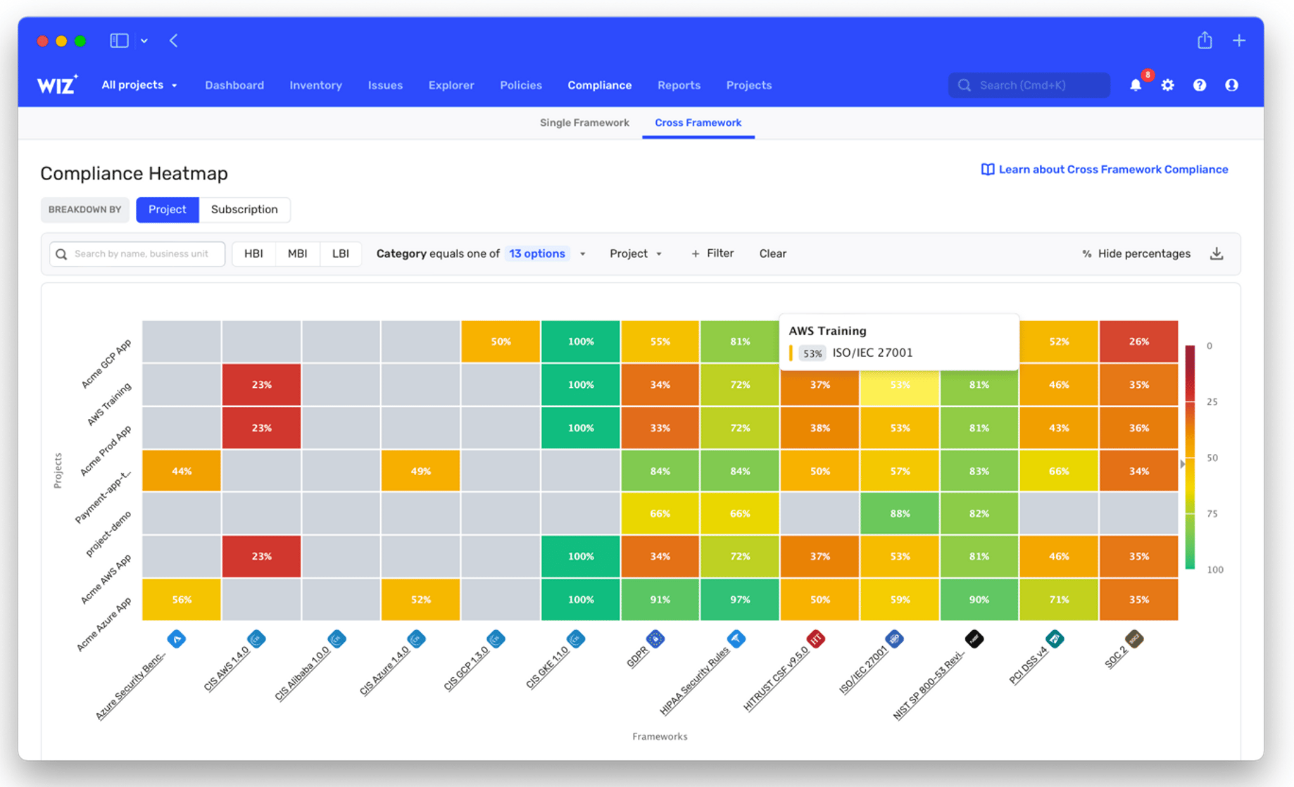
WIZ
The Wiz and Adaptive Shield examples demonstrate two leading approaches to compliance visualization in the security market:
Adaptive Shield
Adaptive Shield takes a different approach that focuses on clear numerical status indicators and failure highlighting. Their tree-structure navigation and expandable controls offer efficient access to compliance data.
These contrasting approaches - Wiz's visual correlation versus Adaptive Shield's numerical clarity - showcase different but effective methods for making complex compliance data accessible to various user personas, from executives to technical teams. Their implementations provide valuable insights for designing competitive compliance management solutions.
Part 2
Wireframes before Fidelity
Before diving into high-fidelity, we started with a low-friction wireframe phase to define layout logic, spatial hierarchy, and overall mental model. These wireframes helped us align quickly across design and product without being blocked by visual polish.
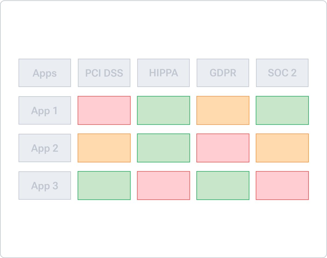
Full Compliance Overview
This draft visualized a universal matrix covering multiple standards side-by-side. The idea was to surface violation volume, severity, and standard alignment in one view. It helped us validate that users needed filtering before scale.
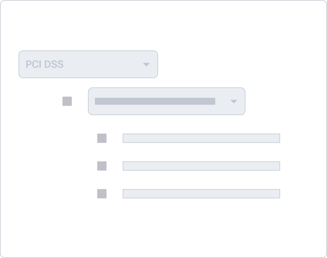
Focused View on PCI DSS
A tighter view showing one compliance standard filtered — this early wireframe introduced the x-axis control structure, mapped to sub-categories within PCI DSS. It validated that contextual scoping reduced cognitive load.
Part 3
High Fidelity in Action
We translated the matrix concept into a series of high-fidelity screens that brought our information architecture to life. These screens were not only design outputs — they helped us validate scroll performance, label hierarchy, and the interaction model under tight time constraints.


oxeye.io


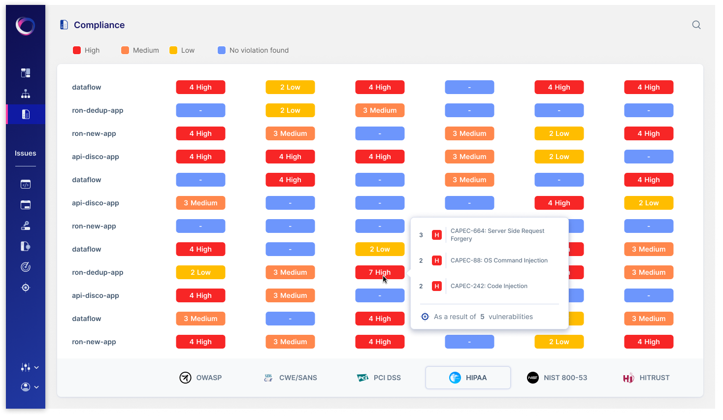
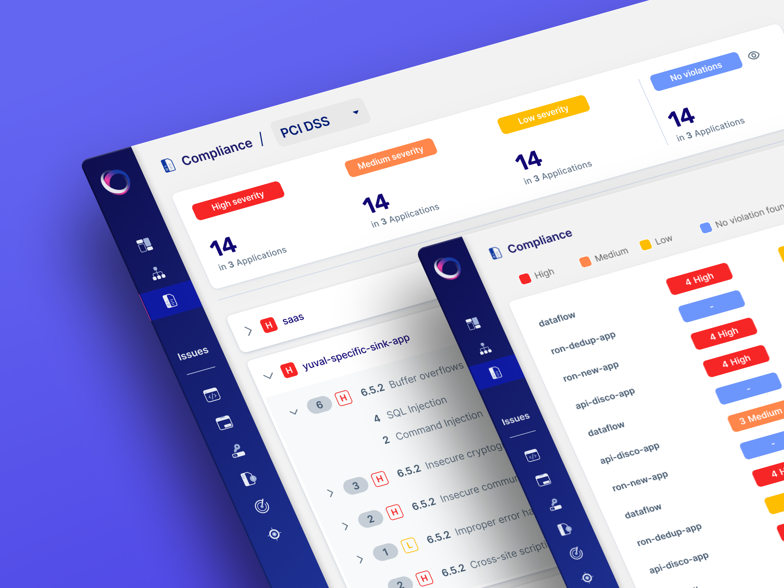
Compliance Overview Matrix
The heatmap serves as the technical team's starting point, showing exactly where compliance violations exist across applications. Security engineers can click any colored cell to access detailed vulnerability information and begin remediation work.
oxeye.io
Deep Dive
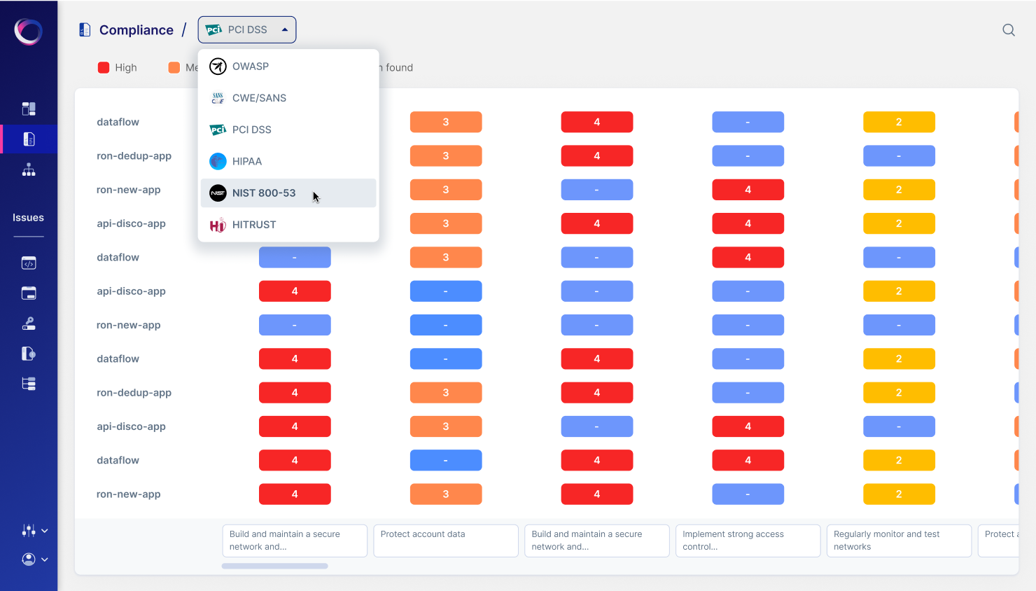
We introduced a dropdown filter at the top of the dashboard allowing users to narrow in on a specific standard like PCI DSS. The filtered matrix shows apps on the left and control domains along the top, with violation counts embedded in each cell. Color coding reflects severity — red for critical, yellow for moderate.This screen showcases our solution for large datasets: horizontal and vertical scrolling with frozen axes. It enables users to navigate across dozens of apps and controls without losing orientation. Engineering tested this with synthetic data to ensure no lag on large orgs.
oxeye.io
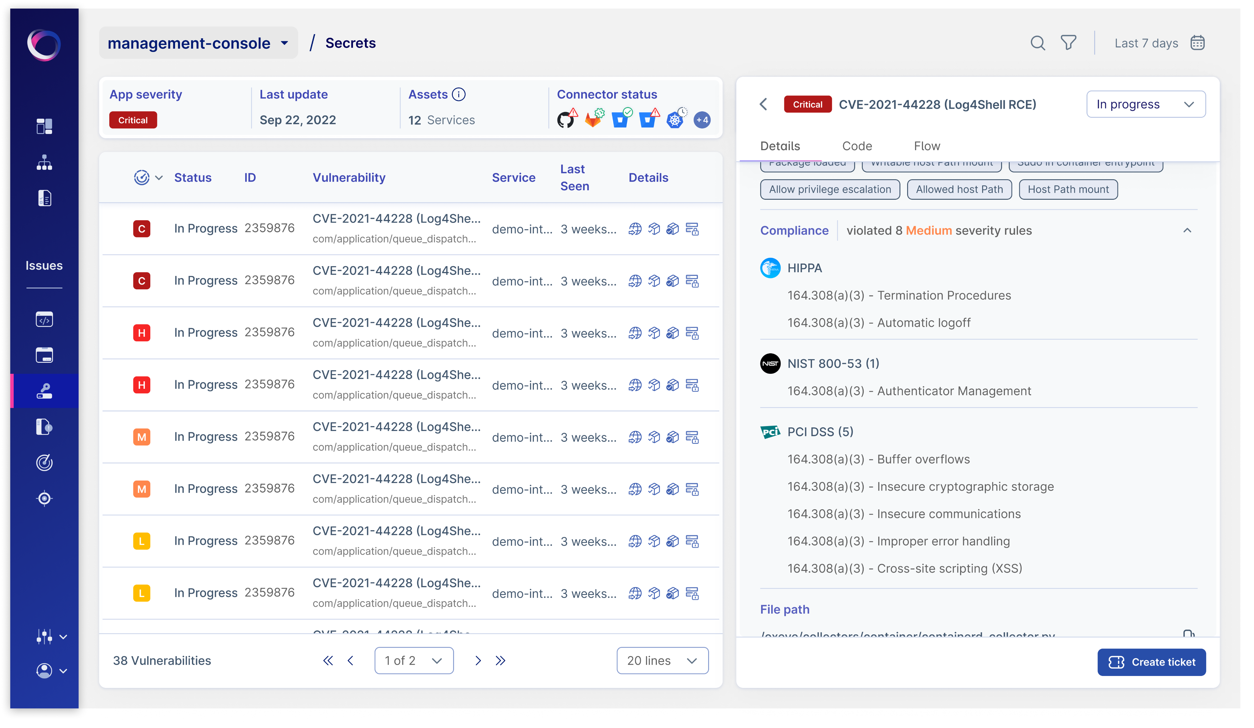
Vulnerability Management
This is the engineer's primary workspace, showing comprehensive technical details for each vulnerability, including CVE information, affected services, and specific compliance rules violated. Engineers can track their progress, document fixes, and create tickets directly from this interface.
Part 4
What we learned
Information density needs structure
We learned that when it comes to compliance, simplicity isn't enough. Teams prefer interfaces that offer rich, layered information — as long as the structure supports quick interpretation. High-context, high-density visuals, when well organized, empower users to act faster with more confidence.
Drill-downs must feel instant
We intentionally removed friction from the drill-down process by replacing click-based interactions with hover previews. This approach allowed users to access violation context immediately, streamlining the investigation workflow without disrupting their visual scan.
Frame the solution
I reworked the color scale to balance urgency with usability. Each severity level—high (red), medium (orange), and low (yellow)—was tuned for both WCAG AA accessibility and intuitive risk signaling, ensuring quick visual parsing without overwhelming the user.
Let’s work together
Case Study
Making Security Compliance Easy
How we redesigned the way security teams track compliance violations across standards like PCI-DSS, HIPAA, and more.
Intro
As the Product Designer, I led the development of an innovative compliance management solution. Working with product managers and developers through multiple design sprints, we shipped a comprehensive dashboard experience over three months.
Part 1
The Challenge
Why we built it?
Our legacy dashboard surfaced violations, but it was fragmented across reports, lacking any spatial hierarchy. There was no way to see how one standard fared across apps, or how one app violated different controls. Security teams were wasting hours in spreadsheets trying to decode compliance posture.
So we reframed the problem.
What if compliance data worked like a heatmap?
We followed a structured three-step hybrid methodology — drawing from Double Diamond and system-first tree models. Time was tight, so we prioritized clarity and cross-team sync over broad user testing.
How we got there?
We followed a structured three-step hybrid methodology — drawing from Double Diamond and system-first tree models. Time was tight, so we prioritized clarity and cross-team sync over broad user testing.
Define the pain
We started with targeted interviews from existing security clients and internal SMEs. Recurring themes:
- “I don’t know where to focus.”
- “Give me a view by standard, not by file.”
- “Show me patterns, not lists.”
This shaped a simple hypothesis: A visual, filterable heatmap will help users understand, compare, and act on violations faster.
Align on architecture
Instead of testing many ideas in the wild, we leaned into tree mapping and matrix modeling to quickly visualize hierarchy and scale.
Insights from quick internal audits:
- Lists create analysis fatigue.
- Predefined controls matter more than categories.
- Severity and volume must coexist in UI.
We tested layout directionality with design leads and engineers — skipping full research sprints due to deadlines.
Frame the solution
We explored three core views to determine the most intuitive way to represent compliance data. Each direction aimed to balance information clarity with scalability across large datasets:
Control Table
A traditional, spreadsheet-style table listing all apps and their corresponding violations across controls. It gave full access to data but quickly became overwhelming. Without visual grouping or color cues, users struggled to spot patterns or severity levels.
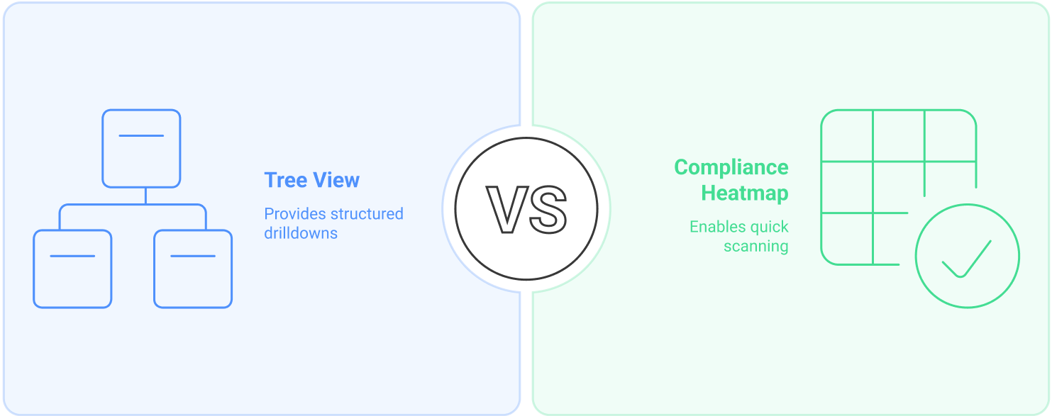
Matrix Heatmap
This was our breakthrough. We structured the matrix with applications on the y-axis and compliance sub-controls on the x-axis. Each cell represented the intersection point — displaying violation counts and colored by severity. This layout allowed users to immediately identify clusters of issues and compare performance across both dimensions. It also supported drill-downs and contextual previews without losing the overview.
WIZ
The Wiz and Adaptive Shield examples demonstrate two leading approaches to compliance visualization in the security market:
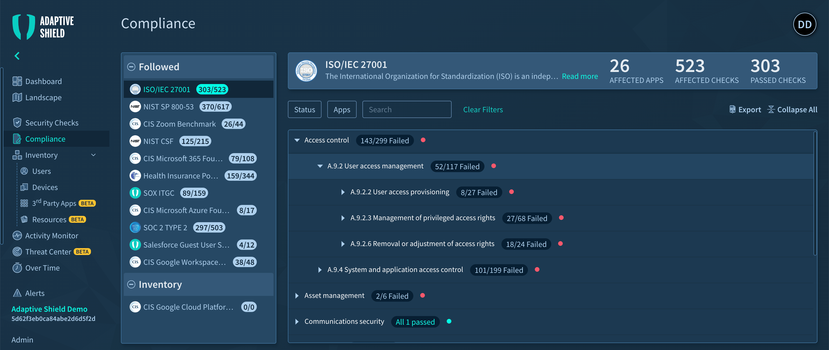
Adaptive Shield
Adaptive Shield takes a different approach that focuses on clear numerical status indicators and failure highlighting. Their tree-structure navigation and expandable controls offer efficient access to compliance data.
These contrasting approaches - Wiz's visual correlation versus Adaptive Shield's numerical clarity - showcase different but effective methods for making complex compliance data accessible to various user personas, from executives to technical teams. Their implementations provide valuable insights for designing competitive compliance management solutions.
Part 2
Wireframes before Fidelity
Before diving into high-fidelity, we started with a low-friction wireframe phase to define layout logic, spatial hierarchy, and overall mental model. These wireframes helped us align quickly across design and product without being blocked by visual polish.
Full Compliance Overview
This draft visualized a universal matrix covering multiple standards side-by-side. The idea was to surface violation volume, severity, and standard alignment in one view. It helped us validate that users needed filtering before scale.
Focused View on PCI DSS
A tighter view showing one compliance standard filtered — this early wireframe introduced the x-axis control structure, mapped to sub-categories within PCI DSS. It validated that contextual scoping reduced cognitive load.
Part 3
High Fidelity in Action
We translated the matrix concept into a series of high-fidelity screens that brought our information architecture to life. These screens were not only design outputs — they helped us validate scroll performance, label hierarchy, and the interaction model under tight time constraints.

oxeye.io
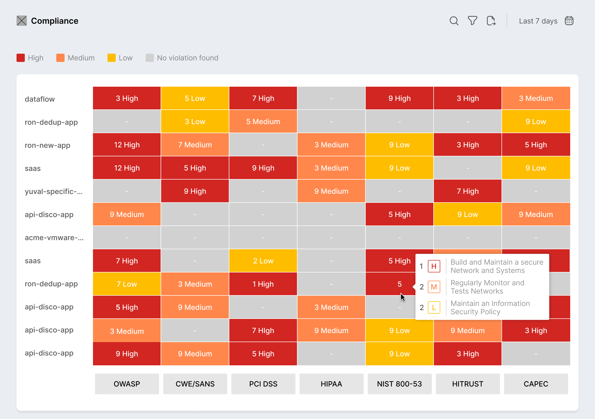
Compliance Overview Matrix
The heatmap serves as the technical team's starting point, showing exactly where compliance violations exist across applications. Security engineers can click any colored cell to access detailed vulnerability information and begin remediation work.
oxeye.io
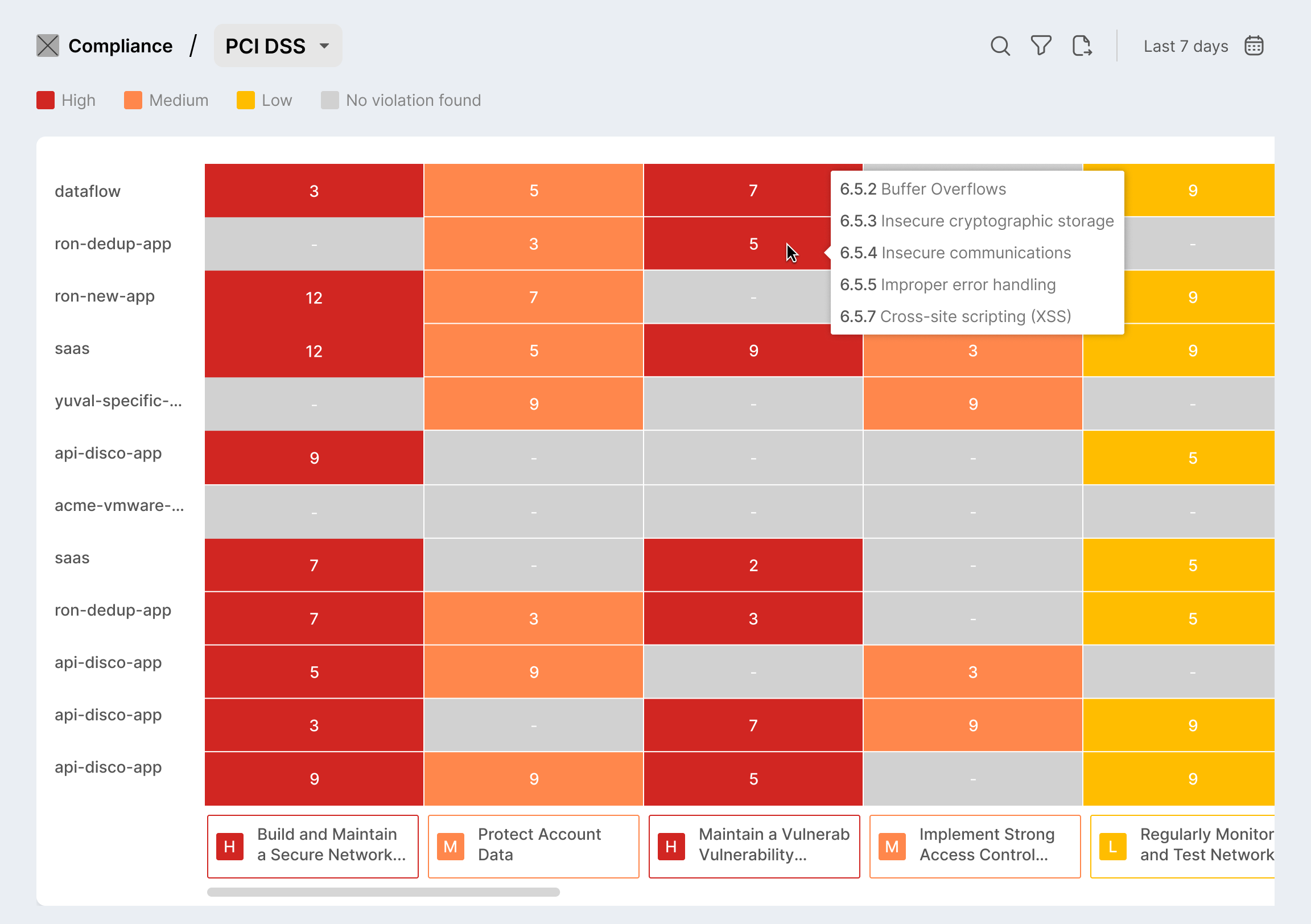
Deep Dive
We introduced a dropdown filter at the top of the dashboard allowing users to narrow in on a specific standard like PCI DSS. The filtered matrix shows apps on the left and control domains along the top, with violation counts embedded in each cell. Color coding reflects severity — red for critical, yellow for moderate.This screen showcases our solution for large datasets: horizontal and vertical scrolling with frozen axes. It enables users to navigate across dozens of apps and controls without losing orientation. Engineering tested this with synthetic data to ensure no lag on large orgs.
oxeye.io
Vulnerability Management
This is the engineer's primary workspace, showing comprehensive technical details for each vulnerability, including CVE information, affected services, and specific compliance rules violated. Engineers can track their progress, document fixes, and create tickets directly from this interface.
Part 4
What we learned
Information density needs structure
We learned that when it comes to compliance, simplicity isn't enough. Teams prefer interfaces that offer rich, layered information — as long as the structure supports quick interpretation. High-context, high-density visuals, when well organized, empower users to act faster with more confidence.
Drill-downs must feel instant
We intentionally removed friction from the drill-down process by replacing click-based interactions with hover previews. This approach allowed users to access violation context immediately, streamlining the investigation workflow without disrupting their visual scan.
Frame the solution
I reworked the color scale to balance urgency with usability. Each severity level—high (red), medium (orange), and low (yellow)—was tuned for both WCAG AA accessibility and intuitive risk signaling, ensuring quick visual parsing without overwhelming the user.
Let’s work together