
Back to Home Page
Back to Home Page
Case Study
A rescue mission that redefined how teams design and build, transforming chaos into a scalable system.
Intro
This is the story of how we rescued a fragmented design system—plagued by duplication, inconsistency, and chaos—and transformed it into a scalable, token-driven, and developer-friendly foundation. What began as a cleanup turned into a journey of structure, clarity, and collaboration.
01 — The Challenge
Scaling Chaos
The company expanded rapidly across multiple teams and platforms (web + mobile). Inconsistent components, overlapping color styles, and undocumented patterns made collaboration difficult. Designers worked in silos. Developers built from scratch.
Key issues:

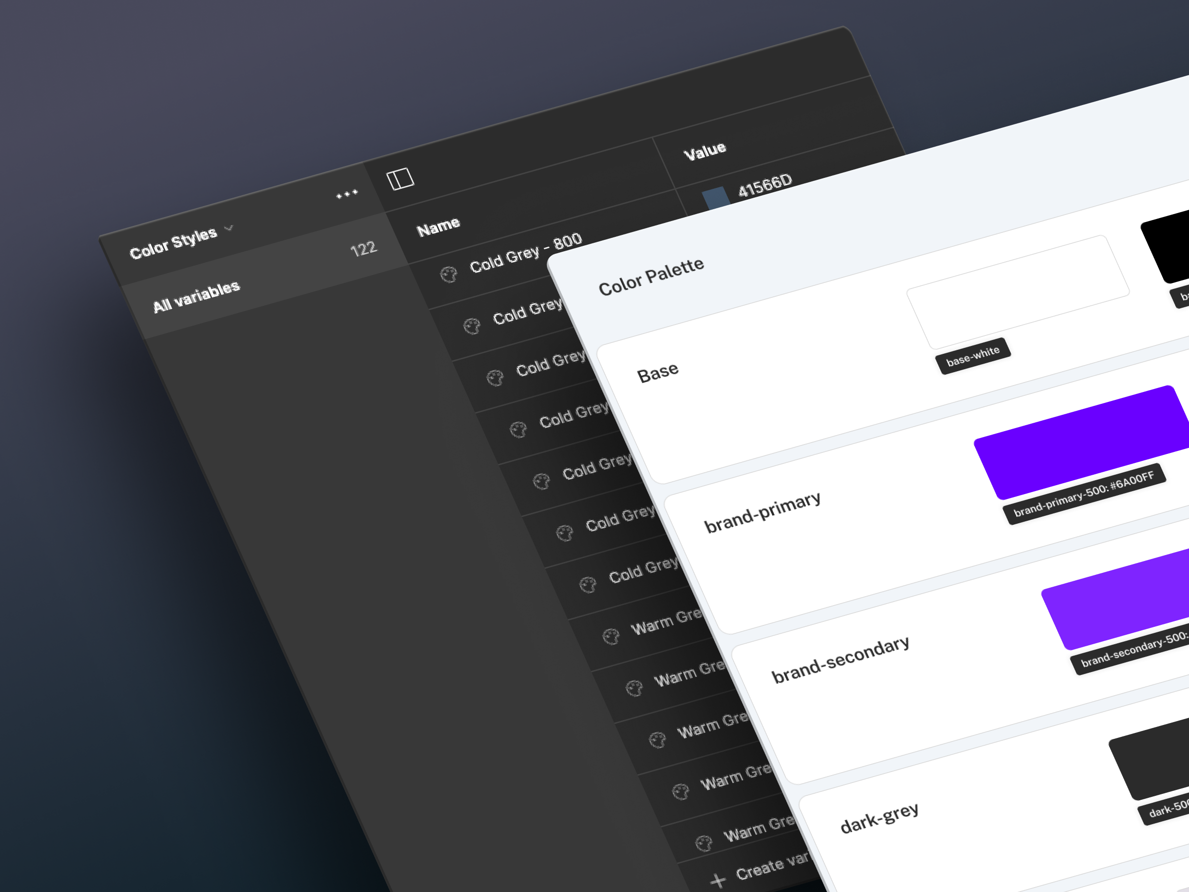
Color Tokens
Core components like buttons existed in multiple slight variations, eroding brand trust and tripling maintenance effort.

Typography
Typography tokens mixed abstract names with functional ones, creating a steep learning curve and frequent implementation errors.

Components
Core components like buttons existed in multiple slight variations, eroding brand trust and tripling maintenance effort.Spending time rebuilding components or searching for the wrong ones.
“We couldn’t trust our own library. Everyone made their own version of the truth.”
Product designer
02 — The Audit process
System Diagnostic
The company expanded rapidly across multiple teams and platforms (web + mobile). Inconsistent components, overlapping color styles, and undocumented patterns made collaboration difficult. Designers worked in silos. Developers built from scratch.
We approached the audit like a rescue operation—step by step:


Inventory
Mapped all tokens, components, and screens in use

Analysis
Identified mismatches, duplications, and inconsistencies

Framework
Proposed a scalable structure aligned with atomic principles

Documentation
Established usage rules and naming conventions

Governance
Defined roles, contribution models, and review workflows
“It felt like forensic operation - we were digging through layers of inconsistency to find the truth.”
Product Design Team Lead
Without consisting naming, components were difficult to discover and maintain. We standardized our Figma naming using a layered structure:

This naming model synced directly with code naming and token references, improving design-dev handoff and enabling automation through tools like Tokens Studio and design linting plugins.
“Treat it like a product, not a Figma file. That mindset changed everything.”
This mindset changed everything.
03 — Rebuilding the foundations
Building Blocks
Rebuilding the design system wasn’t just about cleaning up legacy styles—it was about aligning design and engineering around a common foundation. We adopted a token-first approach and structured our components using atomic design principles.
We aligned on shared definitions for color, typography, spacing, and component behavior using the atomic model:
Atom
These are the foundational building blocks of our system, representing the smallest functional units—like individual tokens (color, spacing, radius) and simple UI elements such as a single button or input field.
The foundational building blocks. Indivisible and abstract. We defined 11 neutral colors, a strict 4px spacing grid, and 2 font families.
Color
Aa
Typography

Iconography
Spacing
Molecule
Molecules emerge when atoms are combined to form relatively simple yet functional components—like a labeled input field, a toggle with label, or an icon button. They demonstrate how layout and hierarchy emerge from token combinations.
Simple, reusable components with a single purpose. We specified every state: default, hover, focus, disabled, and error.
Input Molecule
Search atoms...

Filter Molecule

Filter
Status: Active

Organism
At this level, molecules are assembled into more complex structures—such as a login form or a search header. Organisms are reusable, section-level components that form the backbone of pages and layouts across the product.
This model gave everyone—from product designers to QA engineers—a common language for building and iterating.
“It felt like forensic operation - we were digging through layers of inconsistency to find the truth.”
Product Design Team Lead
Example in Action
We used the atomic model to organize our components and token usage at three key levels: atoms, molecules, and organisms. Each layer is defined by purpose, not just by size, and grounded in semantic token structure.
Button text
Button text
"component": {
"button": {
"base": { "padding": "spacing.3", "radius": "radius.md" },
"primary": {
"bg": "color.primary.100",
"text": "color.text.on-primary"
},
"states": {
"hover": "color.primary.200",
"disabled": "color.neutral.300"
}
}
}
This structured hierarchy allowed us to scale the Button across themes, sizes, and states while promoting consistency and flexibility in design and development workflows.
Below is a card-style comparison that breaks down the atomic hierarchy using the Button and Form_Login examples:
Log in Form
Email Address


name@email.com
Remember me
Cancel
Login
<form style="
background: #fff;
padding: var(--spacing-4);
border: 1px solid #e5e7eb;
border-radius: 12px;
max-width: 400px;
">
<label for="email" style="
display: block;
margin-bottom: 0.5rem;
color: var(--text-label);
font-weight: 600;
">Email</label>
<input id="email" type="email" placeholder="you@example.com" style="
This approach ensured all teams spoke the same language—tokens as the foundation, components as the result. The foundation wasn’t just rebuilt—it was reimagined for scale.
Part 4
Outcomes & Impact
From confusion to clarity
The impact of our system overhaul was immediate and measurable. By restructuring our design tokens, component logic, and documentation, we created a scalable foundation that improved velocity, alignment, and trust across teams.
Nathan Curtis, Eight Shapes
Cultural shift
Our design system wasn’t just a visual language—it became operational infrastructure. Here's what changed on the ground:

Color
We consolidated the palette into structured categories: semantic (success, warning, error), accent (10 hues for charts and UI flare), and neutrals (grayscale scale). Each color was paired with foreground and background tokens to support accessibility.
"status": {
"success": { "bg": { "$value": "#00B386" }, "text": { "$value": "#F8F8F8" } },
"error": { "bg": { "$value": "#D0021B" }, "text": { "$value": "#F8F8F8" } }
}
Typography
We mapped a type scale from xs (12px) to 3xl (48px), each tokenized and named based on intent—e.g. heading.lg, body.sm, label.base—not raw size. This made it easier for devs to apply consistent text across screens.
"font": {
"heading": { "lg": { "$value": "32px" } },
"body": { "sm": { "$value": "14px" }, "base": { "$value": "16px" } },
"label": { "base": { "$value": "12px" } }
}

Spacing
Using a 4px baseline grid, we established spacing tokens from spacing.1 (4px) to spacing.6 (40px). Designers aligned components in Figma using these tokens via Auto Layout. Devs used them in Tailwind-based spacing classes.
Naming
Every component, variant, and state followed a single predictable format: Element_Component__Variant--State. This aligned design, Storybook, and React codebases.
Button_Primary__Small--Disabled
data-testid="button-primary-small-disabled"
Tools
Tokens were exported via Tokens Studio as platform-agnostic JSON. This allowed seamless integration with design files and frontend code. Tokens synced automatically via GitHub Actions into the codebase.
Part 5
What we learned
Rescues don’t always go as planned
Every system transformation comes with assumptions—and lessons. Ours was no exception.
Right move
We started from tokens, which gave us a shared foundation. Once color, spacing, and typography were standardized, everything else fell into place. Our components became composable and themable.
Pleasant surprise
Developers loved the naming system—as long as it mirrored their architecture. Adopting formats like Button_Primary__Small--Disabled helped reduce friction and boosted trust in the system.
Painful miss
We didn’t prioritize documentation soon enough. During onboarding, new team members constantly asked for usage patterns, component anatomy, and naming rules—which we had, but hadn’t shared accessibly.
SteveJobs
What we changed?
Documentation
We created a central documentation hub with token specs, component states, and usage do’s/don’ts.
Governance
Established a governance process to ensure updates were reviewed, versioned, and communicated clearly. Changes now move through a documented pipeline—from proposal to design to review—reducing system drift.
Storybook
Integrated live Storybook embeds alongside design principles.
Takeaway
Treat the design system as a living product, not a static library. It evolves with the organization, and only thrives when maintained with the same rigor as the product it supports. The clarity of shared language, reliable documentation, and structured tokens became the pillars of our system’s long-term success. Adoption is never automatic—it’s earned through clear guidance, shared understanding, and thoughtful education.
Let’s work together
Back to Home Page
Case Study
A rescue mission that redefined how teams design and build, transforming chaos into a scalable system.
Intro
This is the story of how we rescued a fragmented design system—plagued by duplication, inconsistency, and chaos—and transformed it into a scalable, token-driven, and developer-friendly foundation. What began as a cleanup turned into a journey of structure, clarity, and collaboration.
01 — The Challenge
Scaling Chaos
The company expanded rapidly across multiple teams and platforms (web + mobile). Inconsistent components, overlapping color styles, and undocumented patterns made collaboration difficult. Designers worked in silos. Developers built from scratch.
Key issues:
Color Tokens
Analysis of the existing color system revealed a flat structure with no semantic meaning, forcing developers to guess values.

Typography
Typography tokens mixed abstract names with functional ones, creating a steep learning curve and frequent implementation errors.
Components
Core components like buttons existed in multiple slight variations, eroding brand trust and tripling maintenance effort.Spending time rebuilding components or searching for the wrong ones.
“We couldn’t trust our own library. Everyone made their own version of the truth.”
Product designer
02 — The Audit process
System Diagnostic
The company expanded rapidly across multiple teams and platforms (web + mobile). Inconsistent components, overlapping color styles, and undocumented patterns made collaboration difficult. Designers worked in silos. Developers built from scratch.
We approached the audit like a rescue operation—step by step:
Inventory
Mapped all tokens, components, and screens in use
Analysis
Identified mismatches, duplications, and inconsistencies
Framework
Proposed a scalable structure aligned with atomic principles
Documentation
Established usage rules and naming conventions
Governance
Defined roles, contribution models, and review workflows
“It felt like forensic operation - we were digging through layers of inconsistency to find the truth.”
Product Design Team Lead
Without consisting naming, components were difficult to discover and maintain. We standardized our Figma naming using a layered structure:
This naming model synced directly with code naming and token references, improving design-dev handoff and enabling automation through tools like Tokens Studio and design linting plugins.
“Treat it like a product, not a Figma file.”
This mindset changed everything.
03 — Rebuilding the foundations
Building Blocks
Rebuilding the design system wasn’t just about cleaning up legacy styles—it was about aligning design and engineering around a common foundation. We adopted a token-first approach and structured our components using atomic design principles.
We aligned on shared definitions for color, typography, spacing, and component behavior using the atomic model:
Atom
These are the foundational building blocks of our system, representing the smallest functional units—like individual tokens (color, spacing, radius) and simple UI elements such as a single button or input field.
The foundational building blocks. Indivisible and abstract. We defined 11 neutral colors, a strict 4px spacing grid, and 2 font families.
Color
Aa
Typography
Iconography
Spacing
Molecule
Molecules emerge when atoms are combined to form relatively simple yet functional components—like a labeled input field, a toggle with label, or an icon button. They demonstrate how layout and hierarchy emerge from token combinations.
Simple, reusable components with a single purpose. We specified every state: default, hover, focus, disabled, and error.
Input Molecule
Search atoms...
Filter Molecule
Filter
Status: Active
Organism
At this level, molecules are assembled into more complex structures—such as a login form or a search header. Organisms are reusable, section-level components that form the backbone of pages and layouts across the product.
Interactive diagrams and a shared token legend helped teams visualize how styles mapped to functionality and structure. Our system moved from style chaos to clarity—where every element was traceable to a logic-driven decision.This model gave everyone—from product designers to QA engineers—a common language for building and iterating.
“It felt like forensic operation - we were digging through layers of inconsistency to find the truth.”
Product Design Team Lead
Example in Action
We used the atomic model to organize our components and token usage at three key levels: atoms, molecules, and organisms. Each layer is defined by purpose, not just by size, and grounded in semantic token structure.
Button text
Button text
"component": {
"button": {
"base": { "padding": "spacing.3", "radius": "radius.md" },
"primary": {
"bg": "color.primary.100",
"text": "color.text.on-primary"
},
"states": {
"hover": "color.primary.200",
"disabled": "color.neutral.300"
}
}
}
This structured hierarchy allowed us to scale the Button across themes, sizes, and states while promoting consistency and flexibility in design and development workflows.
Below is a card-style comparison that breaks down the atomic hierarchy using the Button and Form_Login examples:
Log in Form
Email Address
name@email.com
Remember me
Cancel
Login
<form style="
background: #fff;
padding: var(--spacing-4);
border: 1px solid #e5e7eb;
border-radius: 12px;
max-width: 400px;
">
<label for="email" style="
display: block;
margin-bottom: 0.5rem;
color: var(--text-label);
font-weight: 600;
">Email</label>
<input id="email" type="email" placeholder="you@example.com" style="
This approach ensured all teams spoke the same language—tokens as the foundation, components as the result. The foundation wasn’t just rebuilt—it was reimagined for scale.
Part 4
Outcomes & Impact
From confusion to clarity
The impact of our system overhaul was immediate and measurable. By restructuring our design tokens, component logic, and documentation, we created a scalable foundation that improved velocity, alignment, and trust across teams.
Nathan Curtis, Eight Shapes
Cultural shift
Our design system wasn’t just a visual language—it became operational infrastructure. Here's what changed on the ground:
Color
We consolidated the palette into structured categories: semantic (success, warning, error), accent (10 hues for charts and UI flare), and neutrals (grayscale scale). Each color was paired with foreground and background tokens to support accessibility.
"status": {
"success": { "bg": { "$value": "#00B386" }, "text": { "$value": "#F8F8F8" } },
"error": { "bg": { "$value": "#D0021B" }, "text": { "$value": "#F8F8F8" } }
}
Typography
We mapped a type scale from xs (12px) to 3xl (48px), each tokenized and named based on intent—e.g. heading.lg, body.sm, label.base—not raw size. This made it easier for devs to apply consistent text across screens.
"font": {
"heading": { "lg": { "$value": "32px" } },
"body": { "sm": { "$value": "14px" }, "base": { "$value": "16px" } },
"label": { "base": { "$value": "12px" } }
}
Spacing
Using a 4px baseline grid, we established spacing tokens from spacing.1 (4px) to spacing.6 (40px). Designers aligned components in Figma using these tokens via Auto Layout. Devs used them in Tailwind-based spacing classes.
Naming
Every component, variant, and state followed a single predictable format: Element_Component__Variant--State. This aligned design, Storybook, and React codebases.
Button_Primary__Small--Disabled
data-testid="button-primary-small-disabled"
Tools
Tokens were exported via Tokens Studio as platform-agnostic JSON. This allowed seamless integration with design files and frontend code. Tokens synced automatically via GitHub Actions into the codebase.
Part 5
What we learned
Rescues don’t always go as planned
Every system transformation comes with assumptions—and lessons. Ours was no exception.
Right move
We started from tokens, which gave us a shared foundation. Once color, spacing, and typography were standardized, everything else fell into place. Our components became composable and themable.
Pleasant surprise
Developers loved the naming system—as long as it mirrored their architecture. Adopting formats like Button_Primary__Small--Disabled helped reduce friction and boosted trust in the system.
Painful miss
We didn’t prioritize documentation soon enough. During onboarding, new team members constantly asked for usage patterns, component anatomy, and naming rules—which we had, but hadn’t shared accessibly.
SteveJobs
What we changed?
Documentation
We created a central documentation hub with token specs, component states, and usage do’s/don’ts.
Governance
Established a governance process to ensure updates were reviewed, versioned, and communicated clearly. Changes now move through a documented pipeline—from proposal to design to review—reducing system drift.
Storybook
Integrated live Storybook embeds alongside design principles.
Takeaway
Treat the design system as a living product, not a static library. It evolves with the organization, and only thrives when maintained with the same rigor as the product it supports. The clarity of shared language, reliable documentation, and structured tokens became the pillars of our system’s long-term success. Adoption is never automatic—it’s earned through clear guidance, shared understanding, and thoughtful education.
Let’s work together