
Back to home page
Back to home page


Version 1.0
40


40
Brand Book Guidelines

This brand book serves as a comprehensive visual and strategic guideline for the Oxeye brand. It defines the core visual identity, design principles, and brand assets to ensure consistency across all touchpoints—from product UI to marketing materials.
01 Brand Strategy
02 Design Process
03 Logo
04 Color
05 Typography
06 Art Direction
07 Applications
This brand book serves as a comprehensive visual and strategic guideline for the Oxeye brand. It defines the core visual identity, design principles, and brand assets to ensure consistency across all touchpoints—from product UI to marketing materials.
Oxeye is the continuous-visibility layer for modern application security: it connects signals into risk paths and reveals where exposure becomes meaningful.
CISOs, AppSec leaders, DevSecOps teams, and engineering organizations that need clarity without slowing delivery.
See risk before it becomes exposure.
Oxeye helps security and engineering teams see the complete path from a vulnerable component to its real-world exposure—so they can act on what matters first.
Connect isolated signals into an understandable route from weakness to impact.
Focus attention on exploitable conditions and meaningful business exposure.
Turn security insight into decisions engineering teams can move on quickly.
This brand book serves as a comprehensive visual and strategic guideline for the Oxeye brand. It defines the core visual identity, design principles, and brand assets to ensure consistency across all touchpoints—from product UI to marketing materials.
Create one reference point for how the brand speaks, looks, and behaves across every team and touchpoint.
Support product growth, align the visual language with Oxeye's cybersecurity mission, and make consistent execution easier.
The outcome is not a collection of isolated files. It is a set of repeatable decisions that scales with new use cases.
Design, engineering, marketing, and content all use the same core rules while adapting them to their working context.
The Oxeye voice is intelligent without being opaque, vigilant without using fear, and technical without losing the human decision behind the data.
Precise
We use specific language, visible evidence, and clear hierarchy. We never hide uncertainty behind broad claims.
Calm
Even when the subject is urgent, the brand stays composed. Clarity is how Oxeye earns trust.
Empowering
Our language helps people decide and act. We illuminate the next move instead of simply presenting more findings.
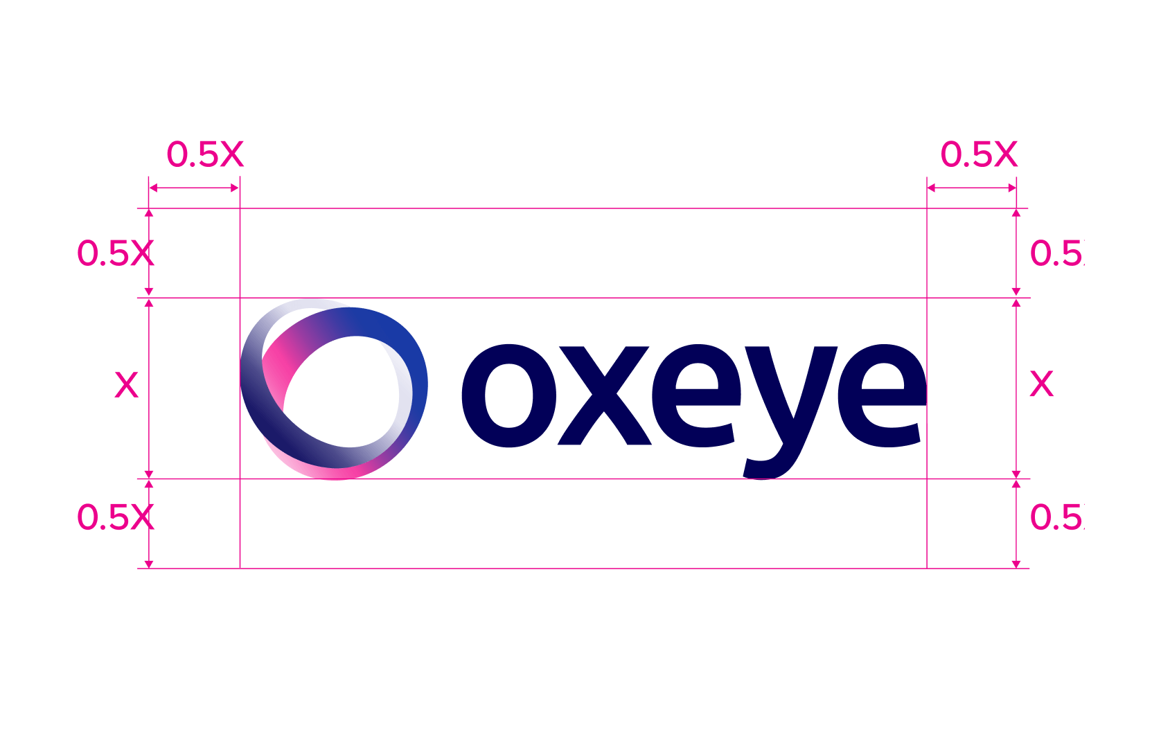
The Oxeye mark combines an eye, an orbit, and a protected core. Its continuous loop expresses visibility across the complete application landscape.
Construction
On dark
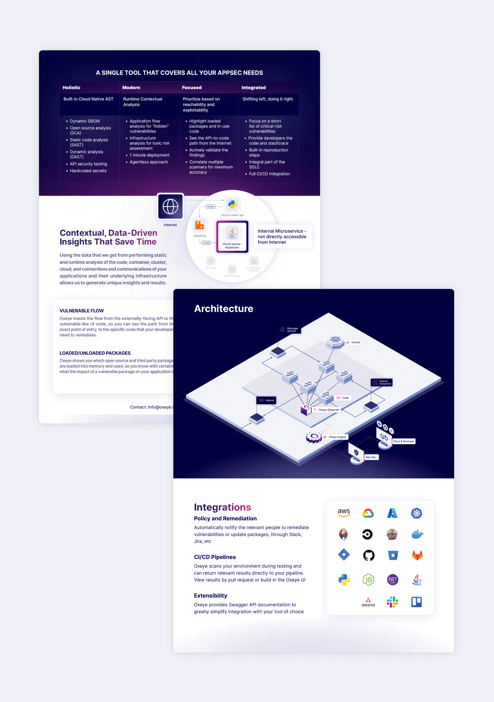
The redesign for Oxeye was initiated at a point when the company aimed to project a more mature and sophisticated image. Building upon their existing three-dimensional design language, we refined the isometric angles and streamlined the graphic style for a cleaner aesthetic. This approach led to the creation of multiple layers of visual representation, ranging from nearly abstract icons and diagrams to more detailed, figurative icons and illustrations. The employment of dark colors, striking gradients, and a sleek overall appearance further accentuates Oxeye's technological prowess and innovative spirit.
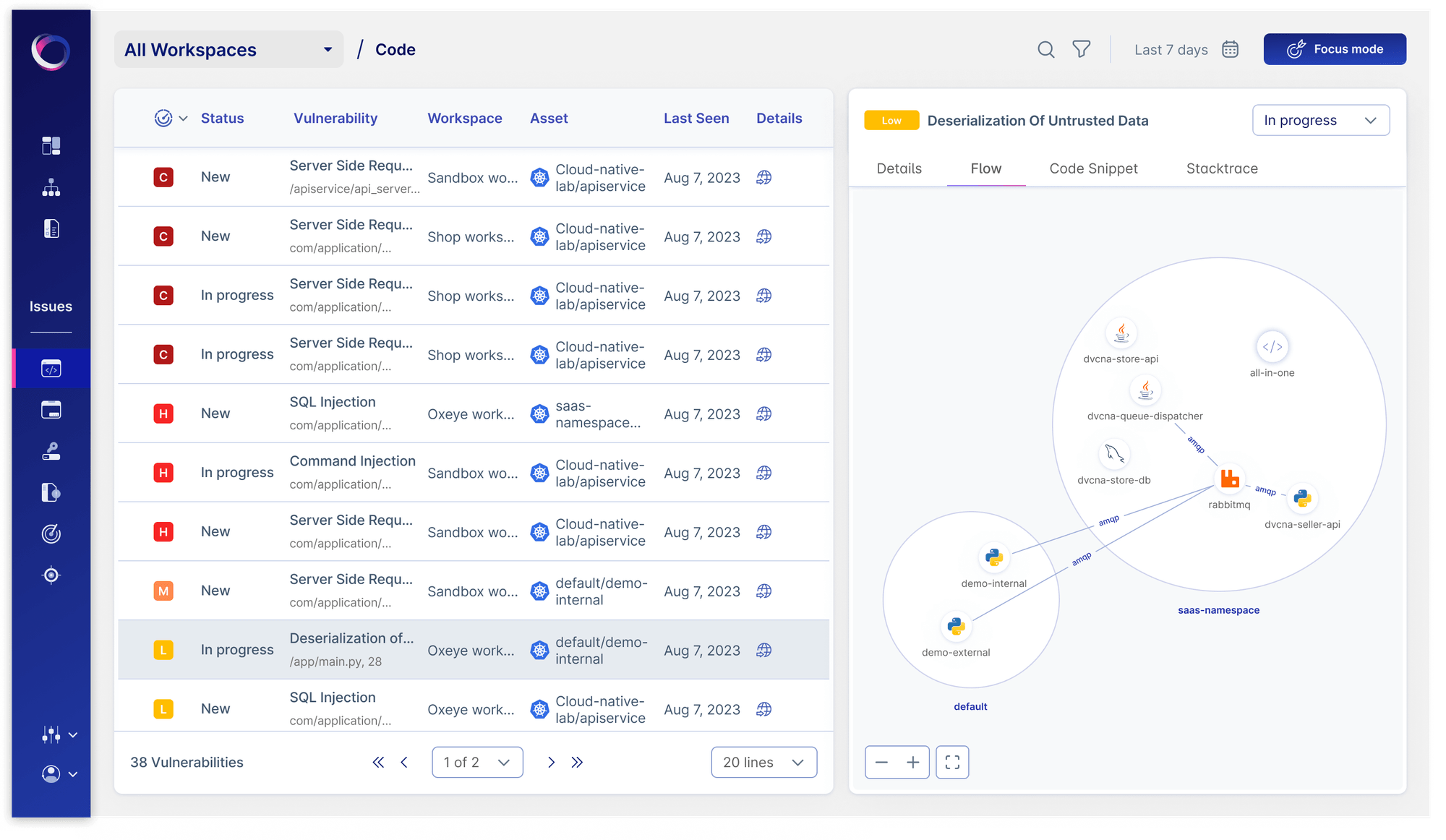
Product
The top part is where the user selects the type of item they want to analyze and its relevant parameters.Users can change their selections as necessary, and the analysis results at the bottom of the page will update accordingly when clicking on "Analyze".
The top part is where the user selects the type of item they want to analyze and its relevant parameters.Users can change their selections as necessary, and the analysis results at the bottom of the page will update accordingly when clicking on "Analyze".
A delicate illustration language built from orbital paths, dots, and a single expressive mark. It reflects the brand’s balance between structure and intuition, showing how human gesture can live inside a scientific system.
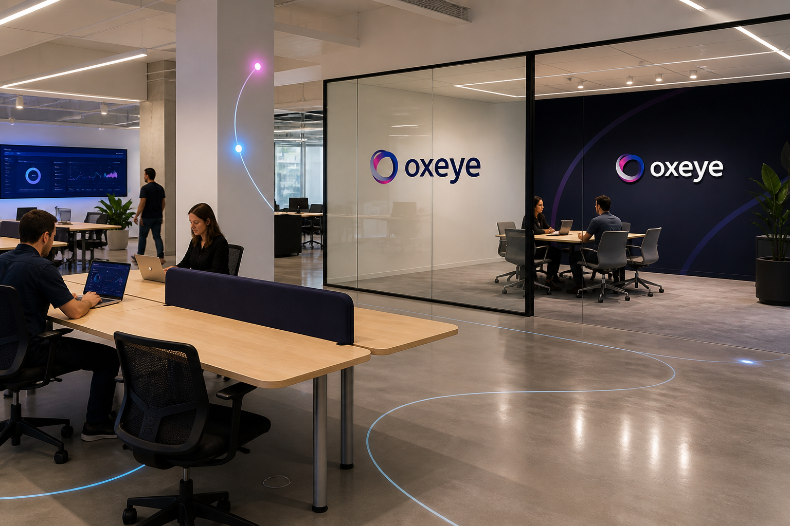
Environmental applications
Soft organic forms and hand-drawn motion lines create a calm visual rhythm. The illustration feels intentional and museum-like, supporting the brand’s personality of curiosity, precision, and refined intelligence.
Oxeye's color palette is built around trust, precision, and depth. The deep navy and vibrant blue primaries communicate reliability and technical authority, while the accent pink adds energy and differentiation. Secondary tones provide flexibility for UI surfaces, backgrounds, and supporting elements.

Accent
#
F63BA2

Accent
#
020058

Secondary Blue 100
#
F3F5FA
Secondary Purple 200
#
D9DAFC
Primary Blue
#
284EA9
Extended color palette
Primary Blue
#
103AA0
Neutral 800
#
273441
Accent
#
F63BA2
Light Grey
#
D9D9D9
Accent
#
020058
Typography for Oxeye should be sleek, contemporary, and easy to read. Use a light grotesque style like Inter Thin for headings to evoke a refined, gallery-like atmosphere.
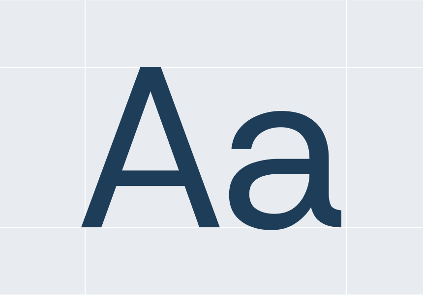
The body text should be straightforward, subtle, and well-organized. Steer clear of bold weights, ornate serifs, or overly technical type styles; the typography must enhance the visual identity without overshadowing the logo or artwork.
Inter is Oxeye's primary typeface, chosen for its exceptional legibility across digital interfaces and print materials. Its clean geometric forms and extensive weight range make it ideal for everything from small UI labels to bold display headings. All typographic decisions should prioritize readability and visual hierarchy.
Aa
INTER
Aa Bb Cc Dd Ee Ff Gg Hh Ii Jj Kk Ll Mm Nn Oo Pp Qq Rr Ss Tt Uu Vv Ww Xx Yy Zz
Aa
INTER
Aa Bb Cc Dd Ee Ff Gg Hh Ii Jj Kk Ll Mm Nn Oo Pp Qq Rr Ss Tt Uu Vv Ww Xx Yy Zz
Aa
Bb
Cc
Dd
Ee
Ff
Gg
Hh
Ii
Jj
Kk
Ll
Mm
Nn
Oo
Pp
Rr
Ss
Tt
Uu
Vv
Ww
Xx
Yy
Zz
0
1
2
3
4
5
6
7
8
9
;
“
´
/
?
Icons extend Oxeye's precision into the smallest product moments. They should clarify navigation, security objects, states, and actions without becoming decoration.
Oxeye uses a consistent set of line icons drawn on a 24×24 grid. Icons should feel precise, minimal, and professional — reflecting the clarity and confidence of the brand. Default line weight is 1.5px. Icons should never be filled or decoratively modified outside of the defined system.


Expand

40


Expand

When using icons in UI contexts, maintain consistent sizing and adequate surrounding space. Icons should always pair with a text label when clarity is required. The icon library covers security, navigation, actions, status, and data visualization categories.
The UI component library extends the Oxeye visual language into functional, reusable design patterns. Each component is built with accessibility and responsiveness in mind, supporting both light and dark display contexts across web and mobile platforms.


40


All component states — default, hover, focus, active, and disabled — are defined and documented. When building new interfaces, always reference this component set before creating custom elements, to maintain visual and functional consistency across the product.
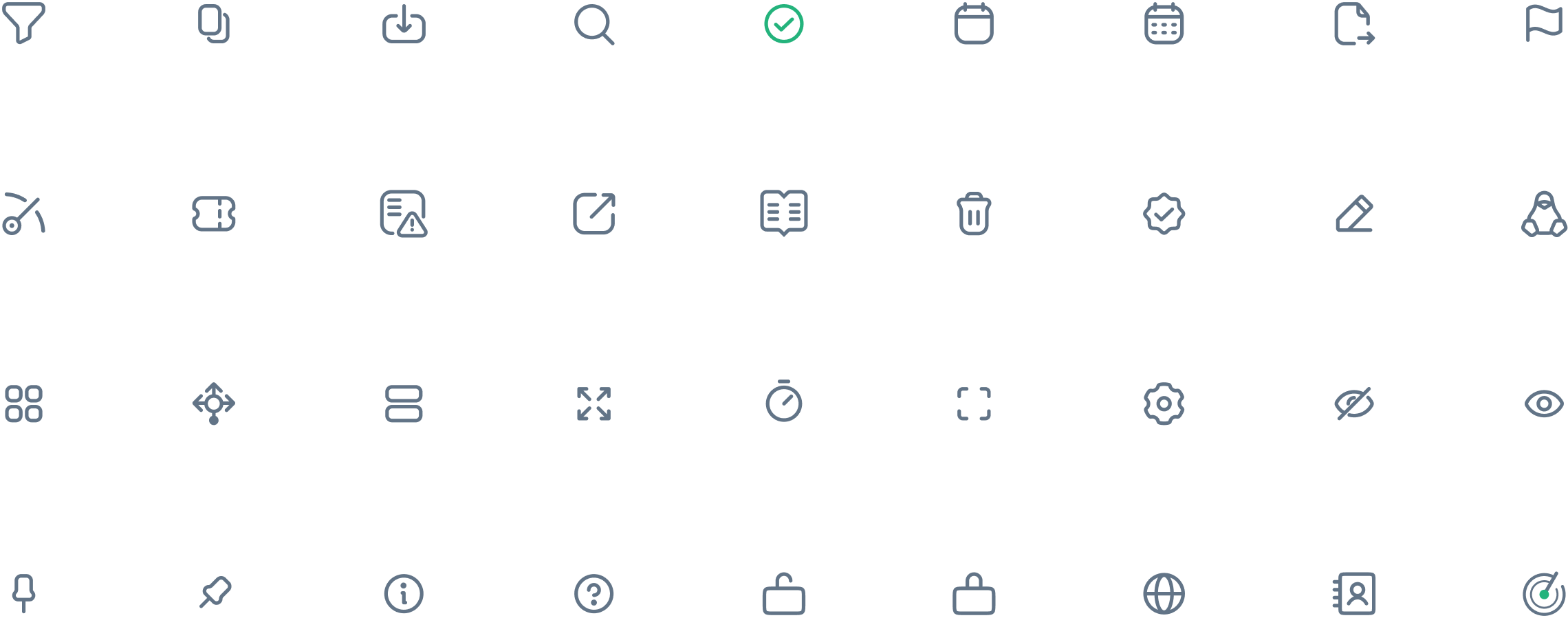
Icons extend Oxeye's precision into the smallest product moments. They should clarify navigation, security objects, states, and actions without becoming decoration.
Spot illustrations are used to add warmth and visual interest to key moments in the product experience — onboarding, empty states, and marketing touchpoints.
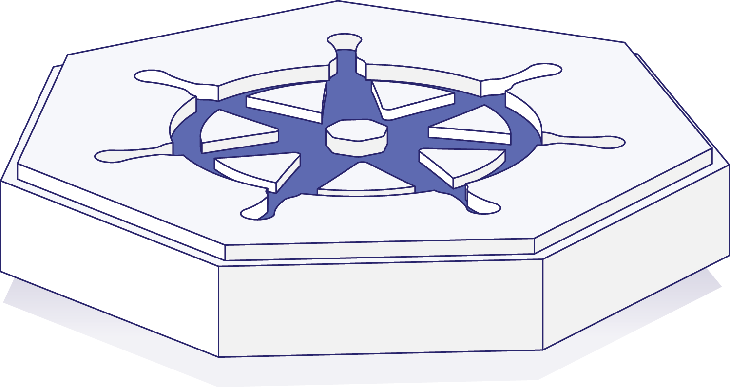
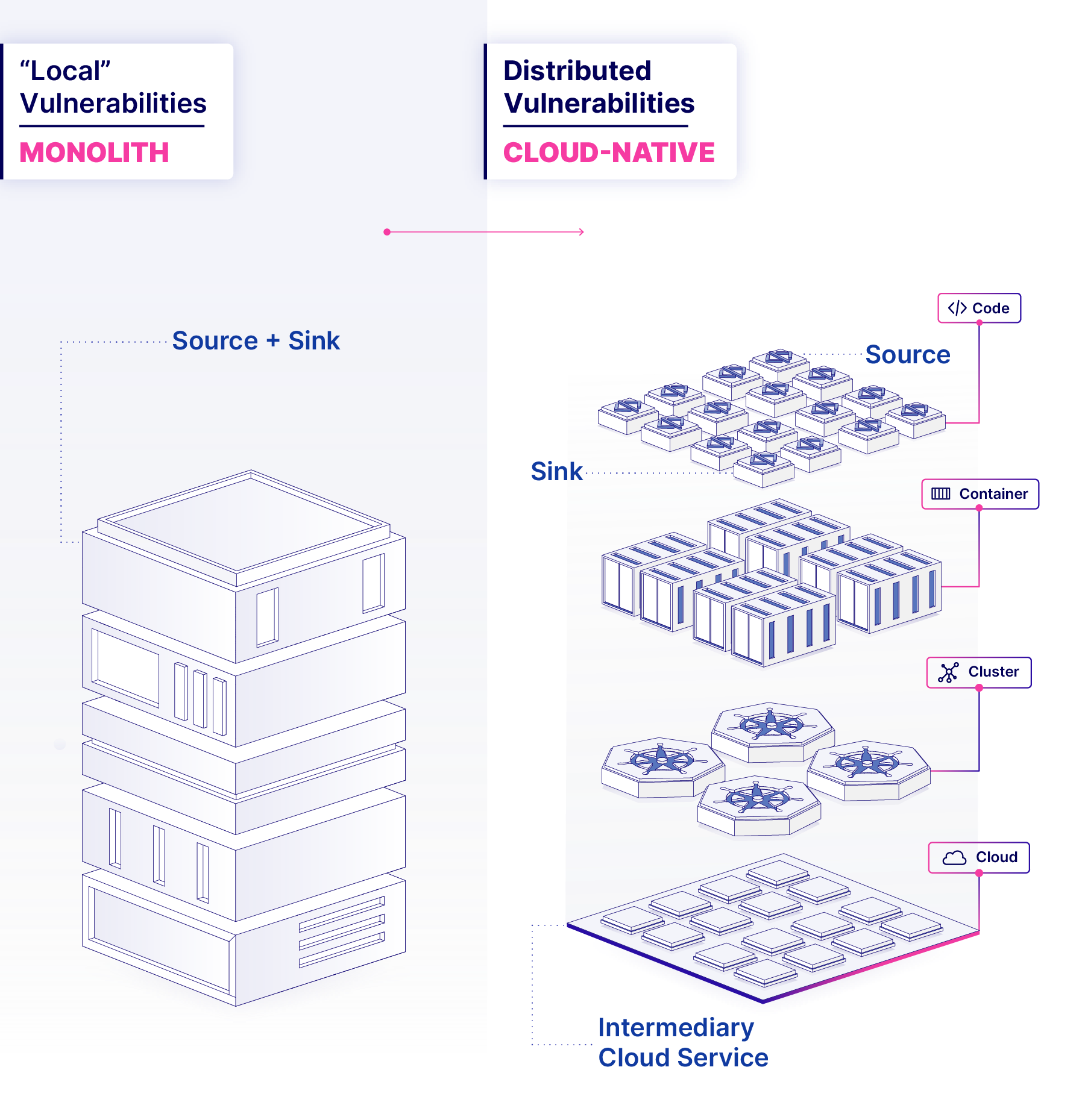
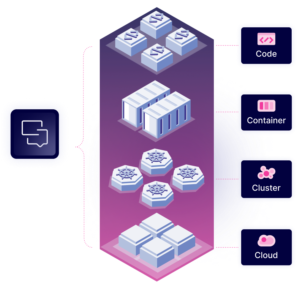
Hero illustrations bring the Oxeye narrative to life in campaign materials and landing pages. They should always feel purposeful and purposefully placed, never purely decorative.


All illustrations follow a consistent style: geometric forms, a limited palette drawn from brand colors, and clean linework. Never mix illustration styles or introduce off-palette colors.


Oxeye's illustration system adds visual depth and personality across digital and print touchpoints. Built from geometric forms and the brand color palette, each illustration reinforces the brand's identity as a precise, forward-looking security platform. Illustrations should complement — not compete with — the typography and interface elements.






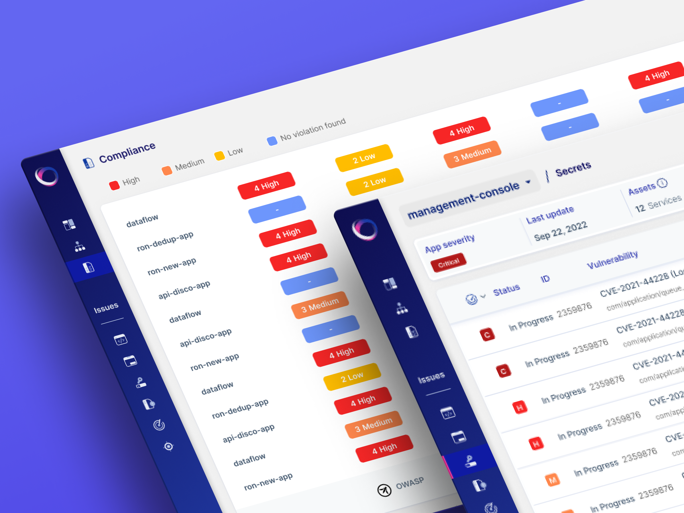
Implementation is where the identity becomes useful. Product screens should inherit the same hierarchy, icon rules, color logic, and continuous-visibility metaphor without turning routine workflows into campaign graphics.
From findings to decisions
Oxeye brings findings, severity, ownership, and policy status into one operational view. A clear hierarchy and consistent state patterns help security teams scan complex data, identify what requires attention, and move from detection to remediation without losing context.
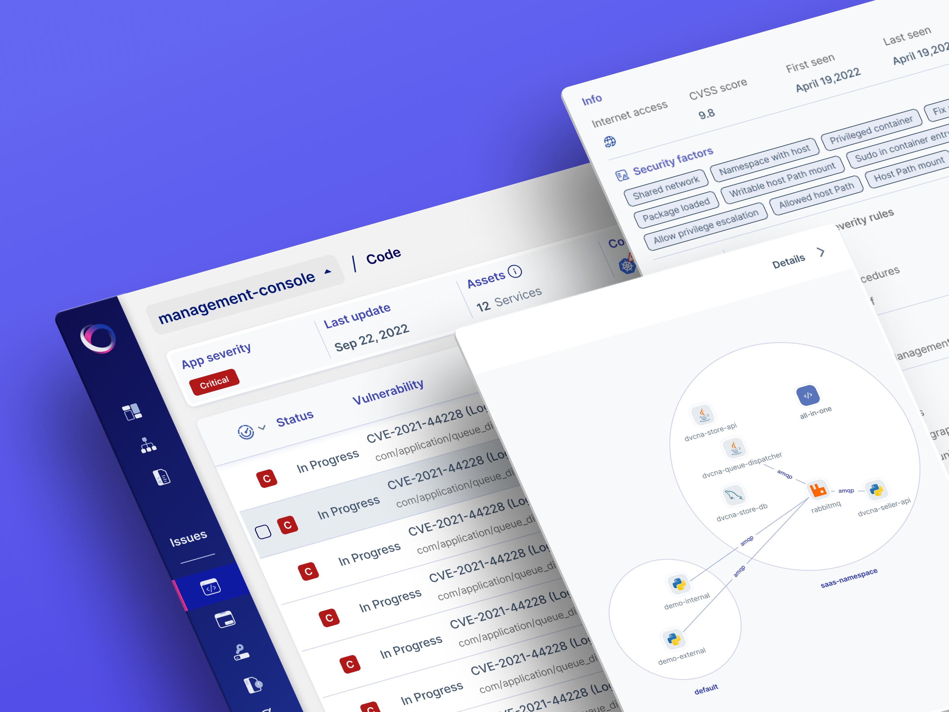
See risk in context
Individual findings become more meaningful when viewed as part of the wider application environment. Oxeye connects code, dependencies, services, and cloud assets in a navigable relationship map—helping teams trace how exposure moves, understand its potential impact, and prioritize action where it matters most.
Oxeye makes complex application risk visible, connected, and actionable. This brand system carries that same clarity into every interaction—from product screens and campaigns to workplaces, events, and everyday objects—using one focused visual language to reveal where exposure begins, how it moves, and where teams should act. The result is a brand that does not merely decorate security; it makes understanding risk feel immediate, precise, and unmistakably Oxeye.

The Polar team’s strategic design approach provided us not only a strong visual identity, but also allowed us to stand out among the competition. Throughout the years of our collaboration, their commitment to our needs was crucial in solidifying our brand in the market. It felt like we were one dedicated team, all aiming towards the success of Oxeye.

Dean Agron
CEO & Co-founder

Let’s work together