
Case Study
How we redesigned the way security teams track compliance violations and more.
Design Trust
Brand Design
REBRAND
DECK DESIGN
MOTION DESIGN
VISUAL LANGUAGE DEVELOPMENT
MARKETING DESIGN


Version 1.0
40


40
Brand Book Guidelines

About the company
Noise Cancellation for Application Security. Built for cloud-native applications using container and Kubernetes-based architectures.
$5.3M
Total Funding Amount
5
Investors
2
Funding Rounds

The Polar team’s strategic design approach provided us not only a strong visual identity, but also allowed us to stand out among the competition. Throughout the years of our collaboration, their commitment to our needs was crucial in solidifying our brand in the market. It felt like we were one dedicated team, all aiming towards the success of Oxeye.

Dean Agron
CEO & Co-founder

Branding and Marketing Design
Brand Design
REBRAND
VISUAL LANGUAGE DEVELOPMENT
MARKETING DESIGN
DECK DESIGN
MOTION DESIGN
Rebrand
Oxeye requested that we retain their existing logo while enhancing the significance of its icon. To achieve this, we focused on refining the cleanliness, adjusting the size ratios between the various elements, and ensuring the precision of the color scheme. These modifications have given the icon a more pronounced presence, allowing it to complement the adjacent typography more effectively.
Logo
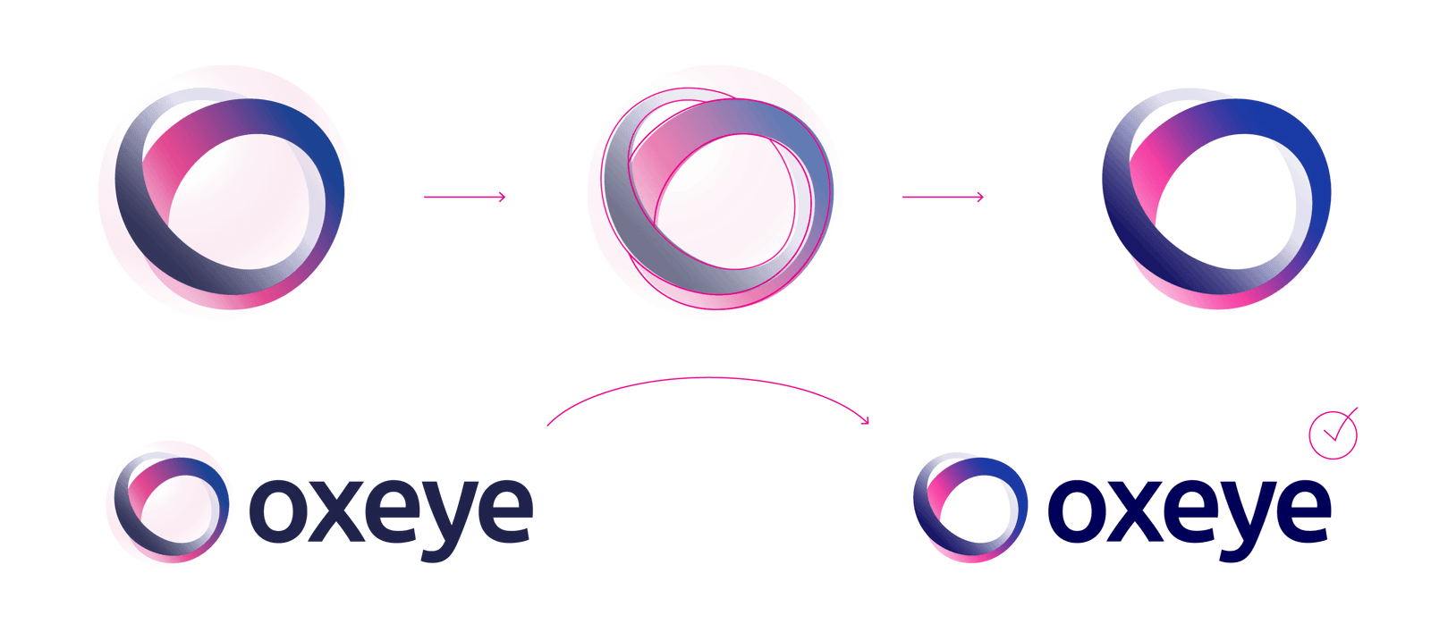
Construction
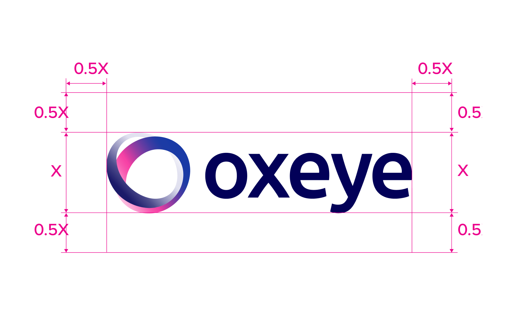
On dark
Icons and
Illustrations
Redesign
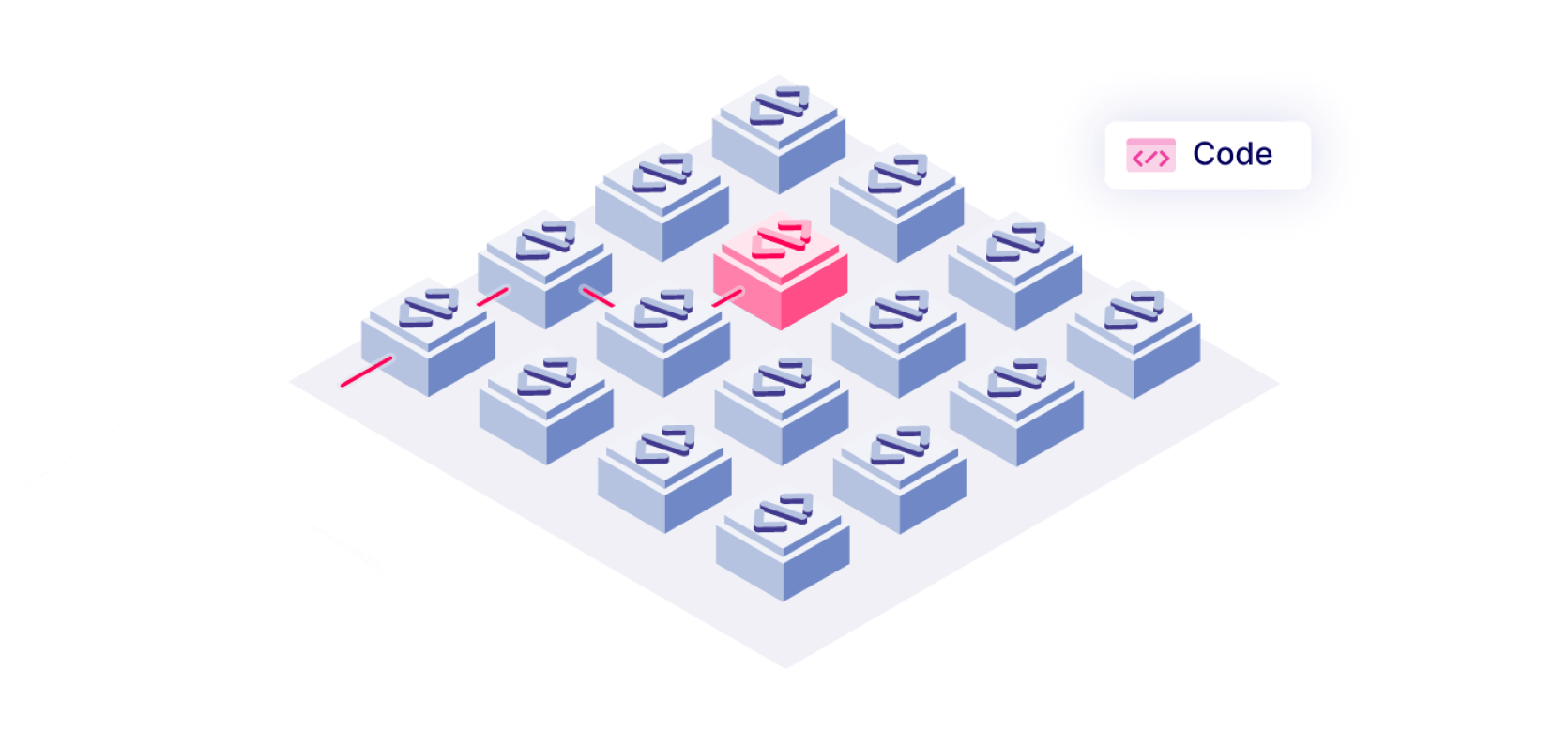
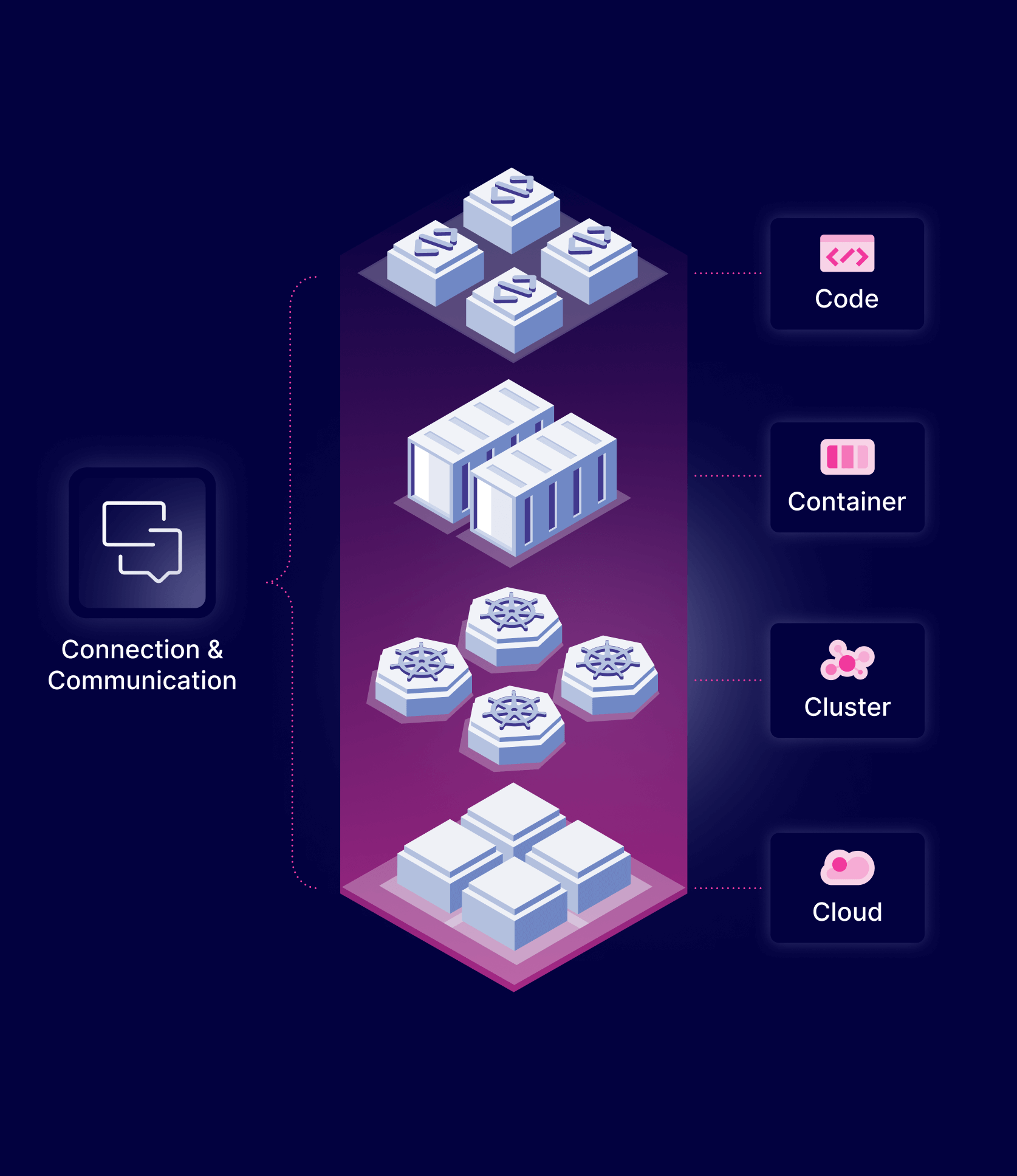
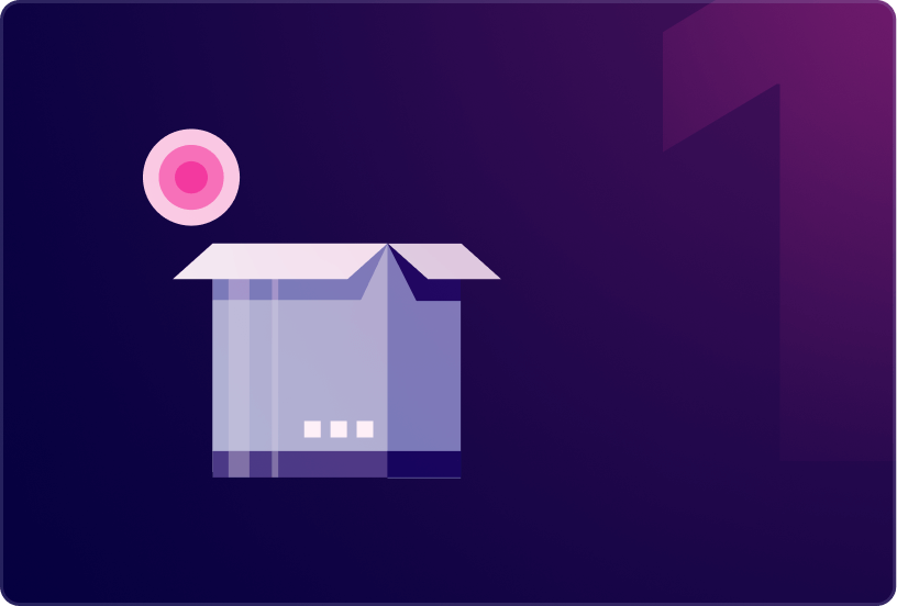
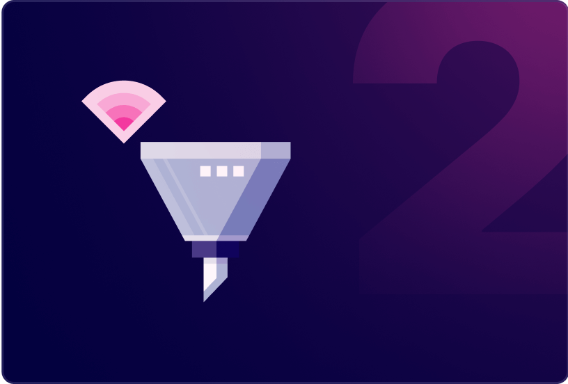
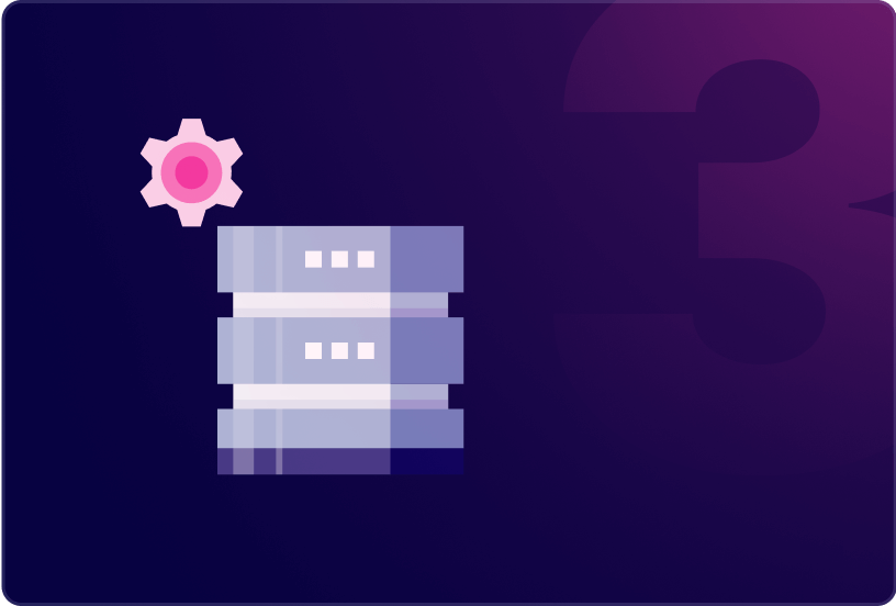
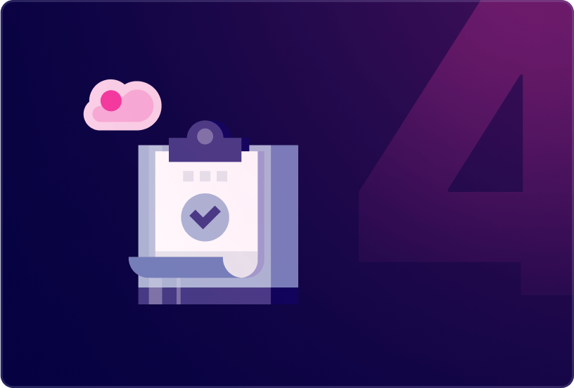
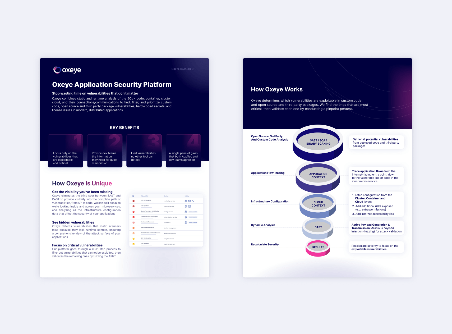
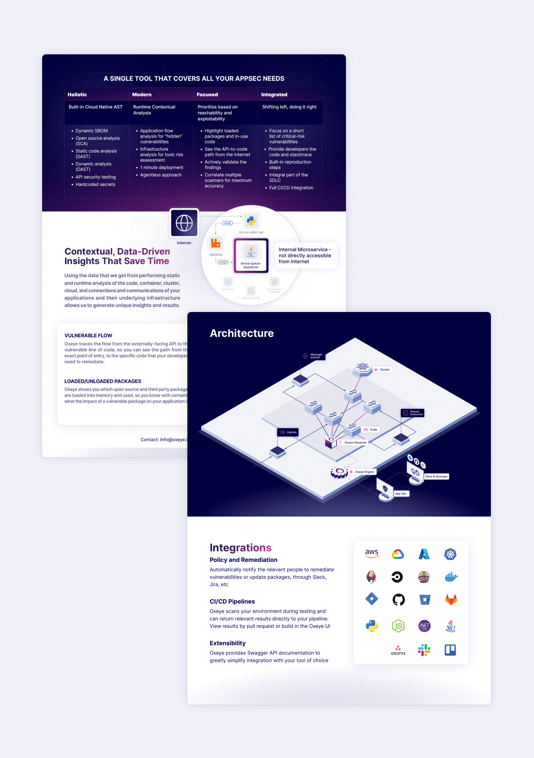
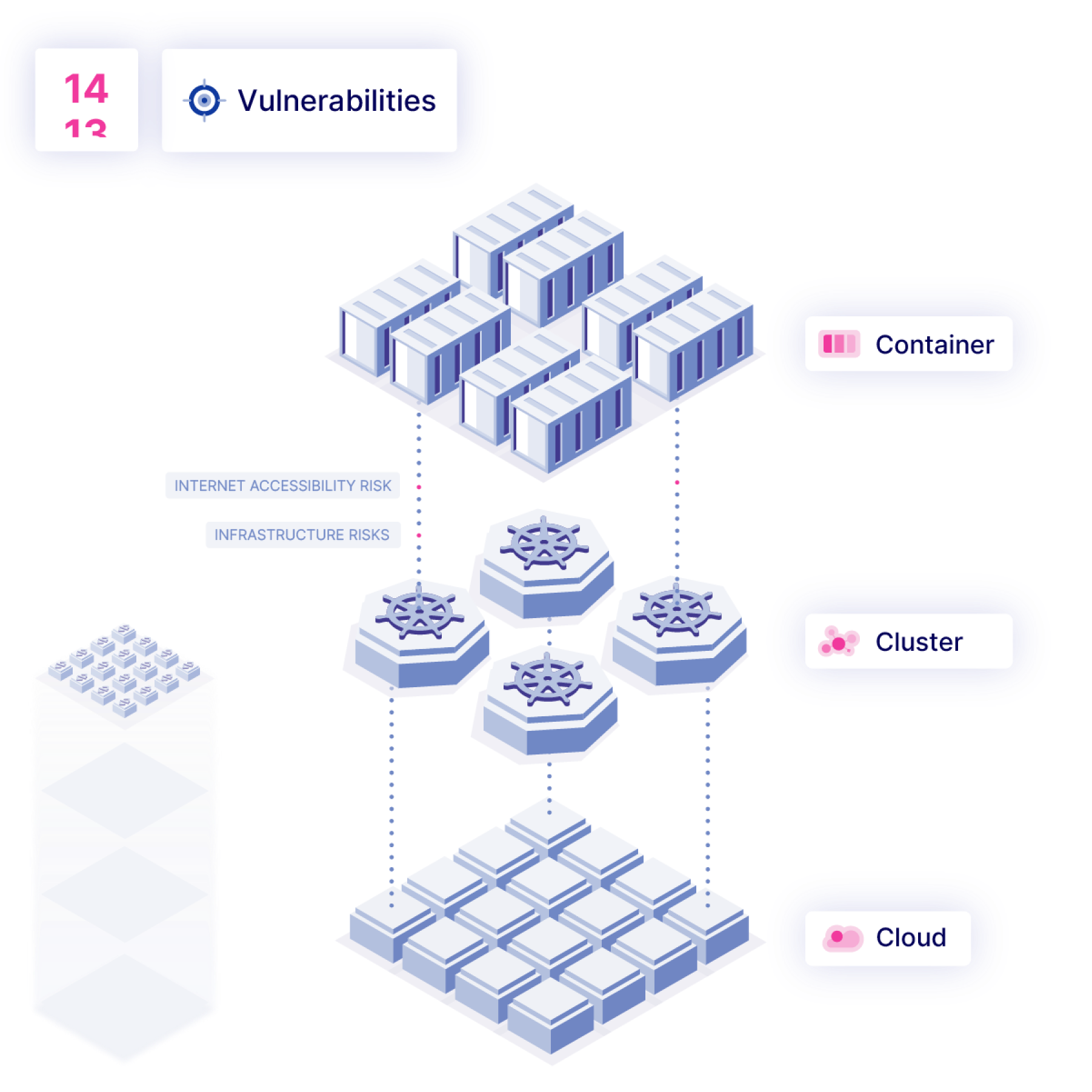
The redesign for Oxeye was initiated at a point when the company aimed to project a more mature and sophisticated image. Building upon their existing three-dimensional design language, we refined the isometric angles and streamlined the graphic style for a cleaner aesthetic. This approach led to the creation of multiple layers of visual representation, ranging from nearly abstract icons and diagrams to more detailed, figurative icons and illustrations. The employment of dark colors, striking gradients, and a sleek overall appearance further accentuates Oxeye's technological prowess and innovative spirit.
Marketing
Assets
Web Design
Web UX
Web Design
Design System
Development and QA
Design and Development
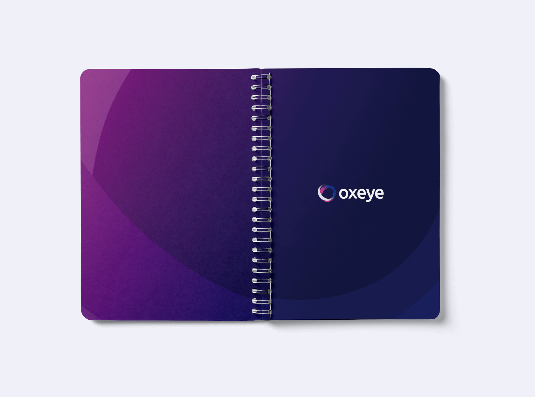
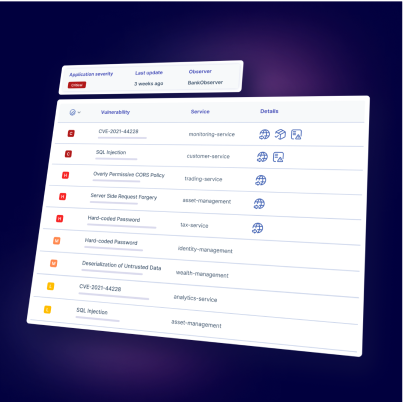
Our design process was centered around simplifying Oxeye’s solution, ensuring it could be easily understood by visitors. Through a combination of dark colors, light pink gradients, and subtle glass effects, we created a visually captivating website that effectively showcases the innovative technology behind the product.






















Product Design
UX/UI
PRODUCT DESIGN
Design System
Challenge
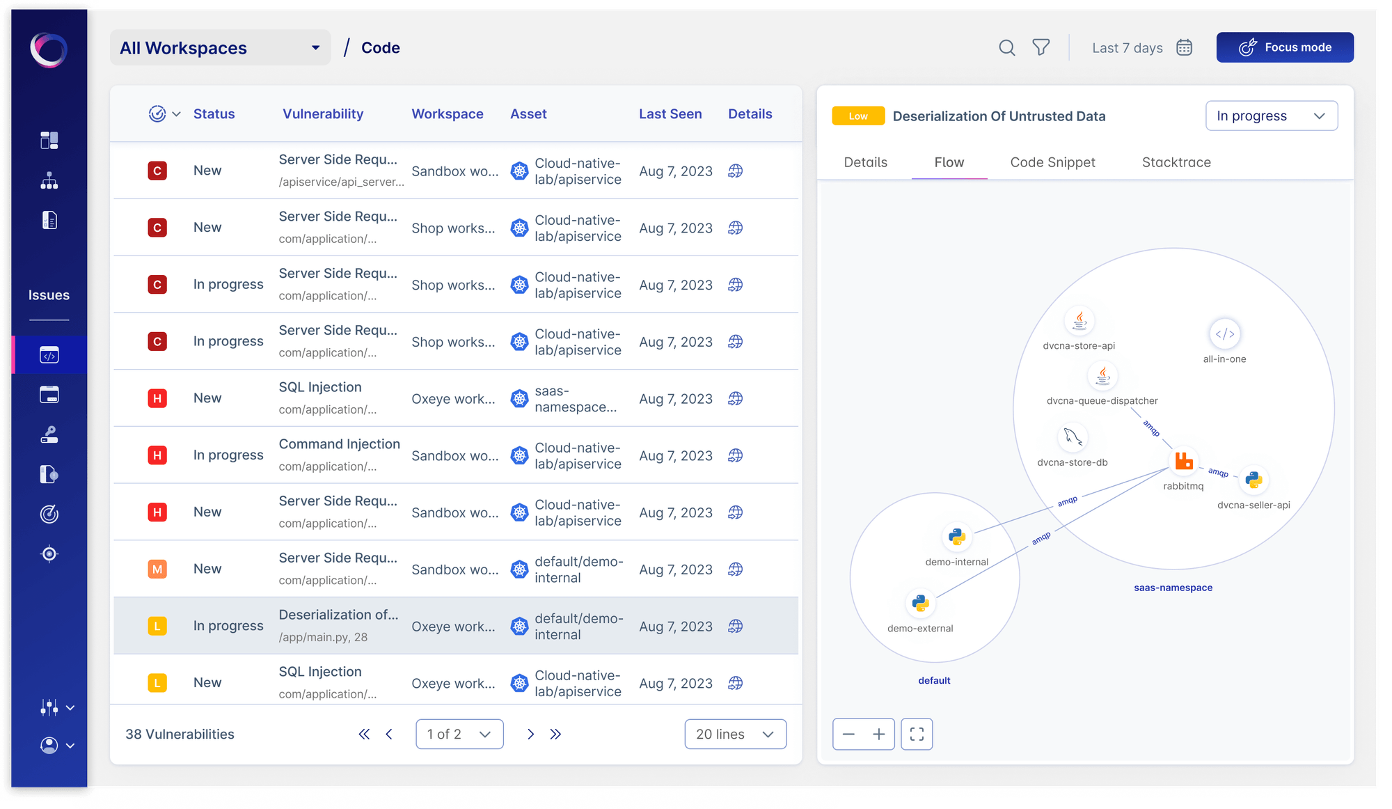
Combine a long list of an application's issues and vulnerabilities with detailed information about each one, including a map of the cloud environment in context.
User Experience
The large amount of information available for each issue is divided into tabs by topic. Above them users can always see the issue’s identifier and severity, and change its remediation status.
In the diagram we show the detailed information of the selected issue relevant to the selected tab. In this case we can see the map, which helps the user orient themselves and gain visibility into their cloud environment. It also provides important information regarding the given issue - where it is within the environment and whether it is connected to the internet, for example.
Product Screens
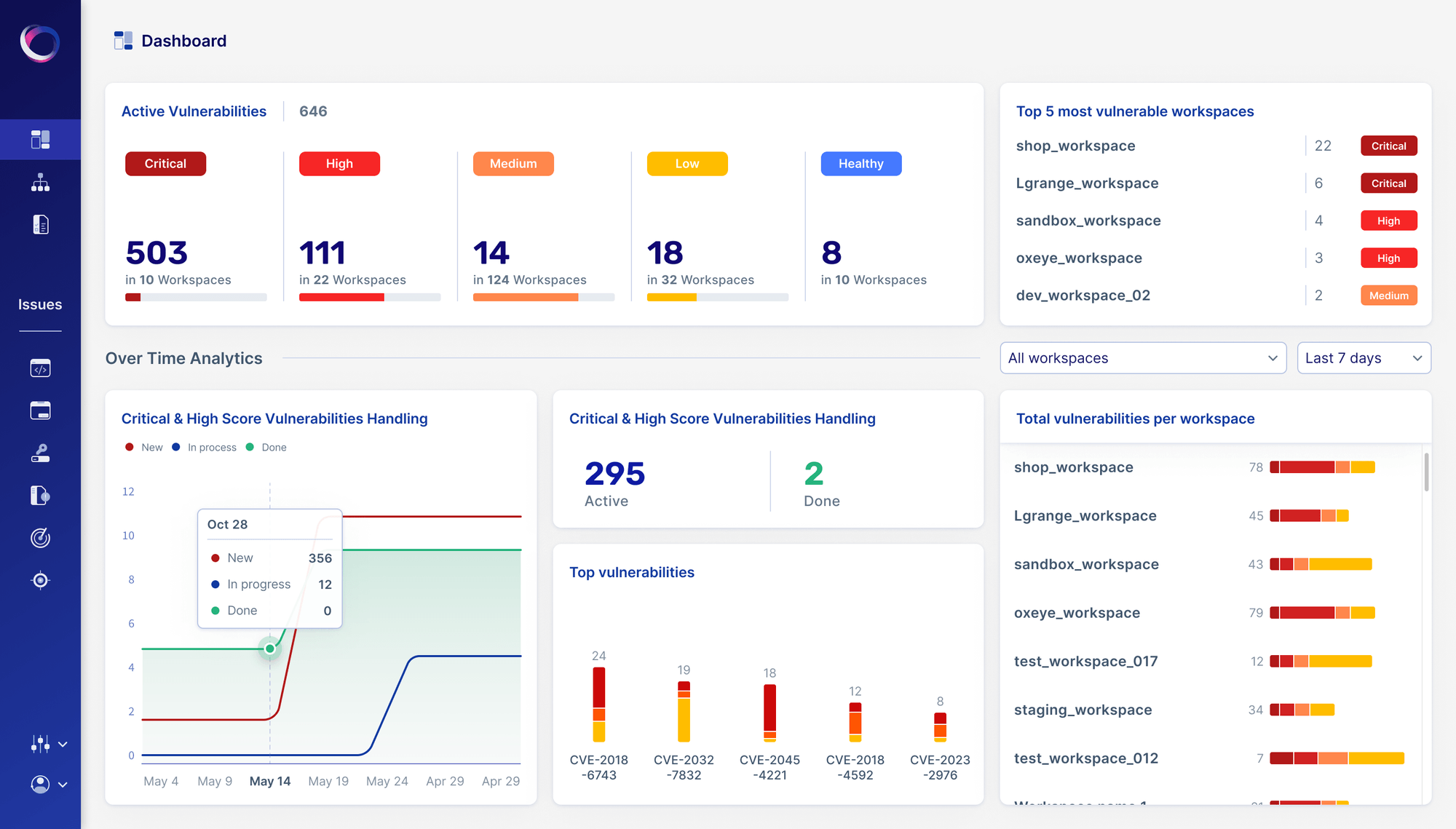
The top part is where the user selects the type of item they want to analyze and its relevant parameters.Users can change their selections as necessary, and the analysis results at the bottom of the page will update accordingly when clicking on "Analyze".
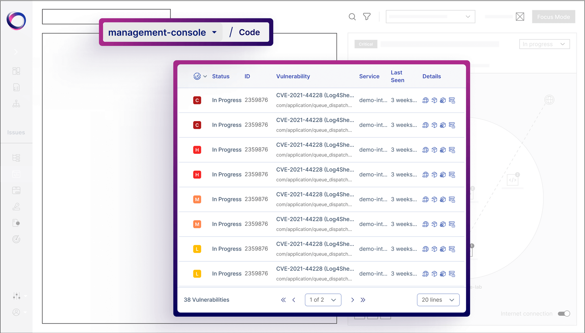
Here the user can select which application to explore. Placing the selection at the top of the page, as part of the breadcrumbs, makes it intuitive and easy to find. It effortlessly tells the story of what the user is looking at.
The table contains the list of all of the issues found in the selected application, in the selected type of issue - the issue type itself can be selected from the main menu. Each row contains the relevant information the user needs so that they can choose which issue they want to dive into.
Design System

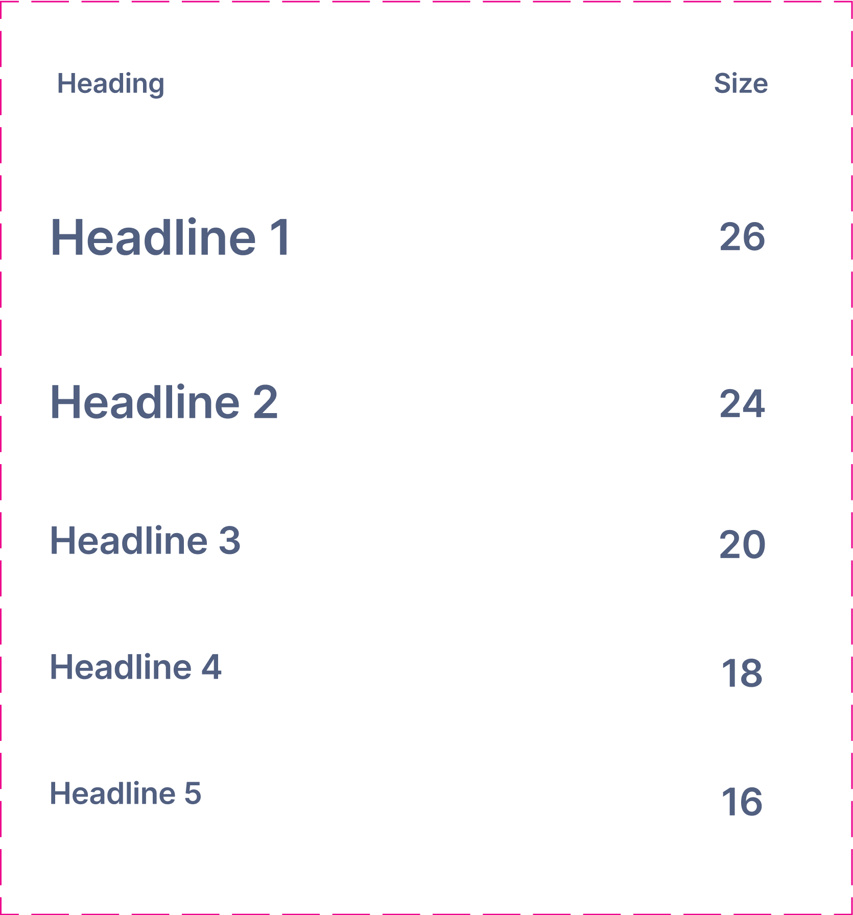
Typography

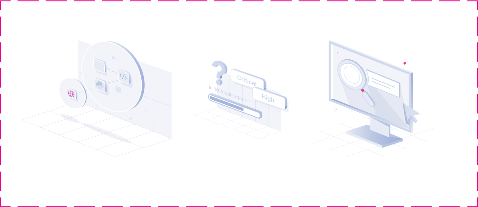
Empty States
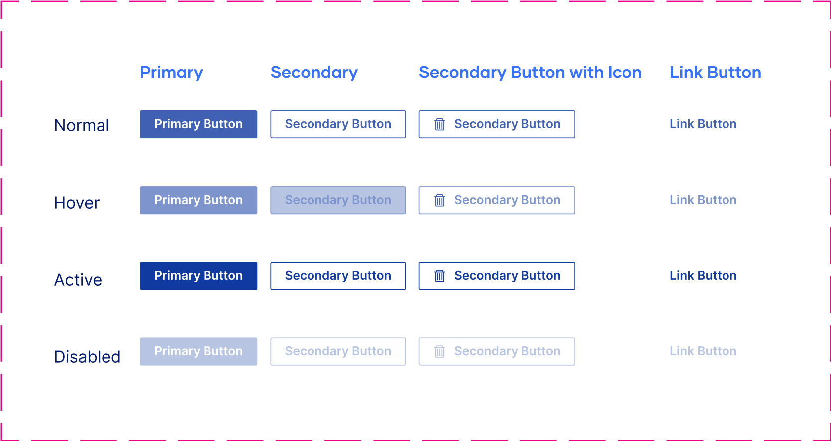
Buttons

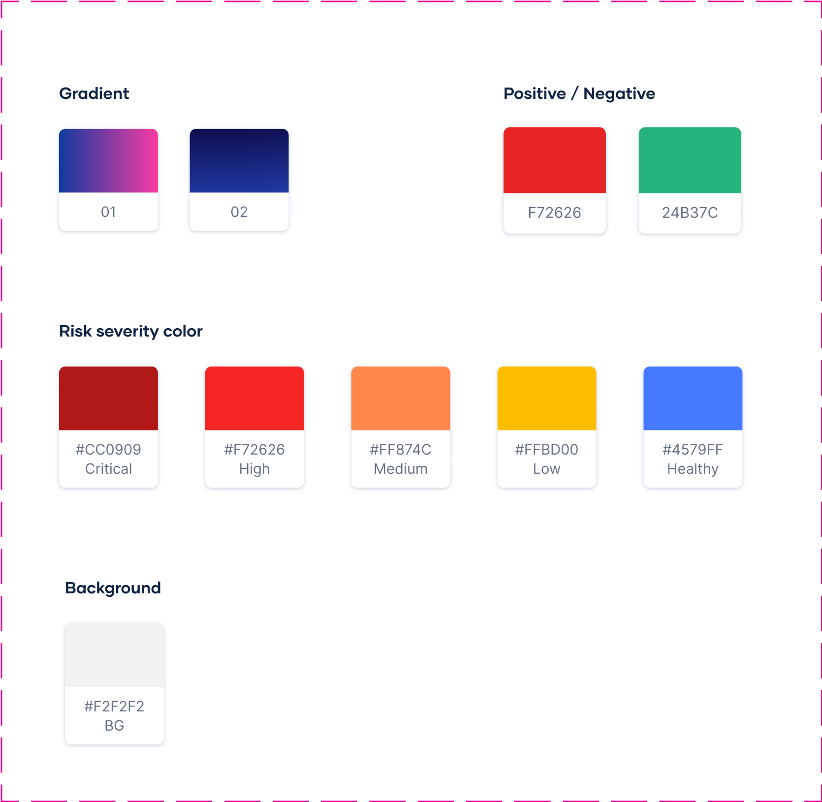
Colors
Let’s work together
Case Study
Design Trust
How we redesigned the way security teams track compliance violations and more.
Brand Design
REBRAND
DECK DESIGN
MOTION DESIGN
VISUAL LANGUAGE DEVELOPMENT
MARKETING DESIGN


Version 1.0
40
40
Brand Book Guidelines

About the company
Noise Cancellation for Application Security. Built for cloud-native applications using container and Kubernetes-based architectures.
$5.3M
Total Funding Amount
5
Investors
2
Funding Rounds
The Polar team’s strategic design approach provided us not only a strong visual identity, but also allowed us to stand out among the competition. Throughout the years of our collaboration, their commitment to our needs was crucial in solidifying our brand in the market. It felt like we were one dedicated team, all aiming towards the success of Oxeye.
Dean Agron
CEO & Co-founder
Branding and Marketing Design
Brand Design
REBRAND
VISUAL LANGUAGE DEVELOPMENT
MARKETING DESIGN
DECK DESIGN
MOTION DESIGN
Rebrand
Oxeye requested that we retain their existing logo while enhancing the significance of its icon. To achieve this, we focused on refining the cleanliness, adjusting the size ratios between the various elements, and ensuring the precision of the color scheme. These modifications have given the icon a more pronounced presence, allowing it to complement the adjacent typography more effectively.
Logo
Construction
On dark
Icons and
Illustrations
Redesign
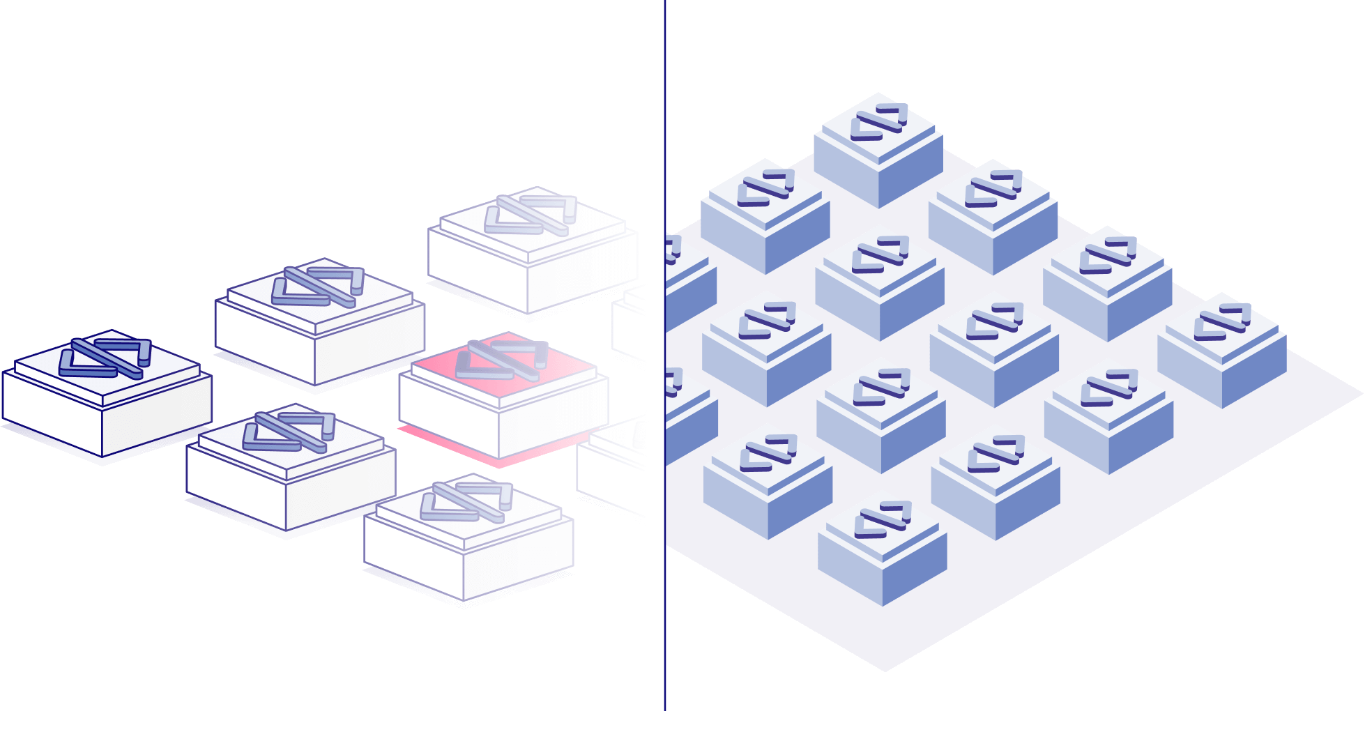
The redesign for Oxeye was initiated at a point when the company aimed to project a more mature and sophisticated image. Building upon their existing three-dimensional design language, we refined the isometric angles and streamlined the graphic style for a cleaner aesthetic. This approach led to the creation of multiple layers of visual representation, ranging from nearly abstract icons and diagrams to more detailed, figurative icons and illustrations. The employment of dark colors, striking gradients, and a sleek overall appearance further accentuates Oxeye's technological prowess and innovative spirit.
BEFORE
After
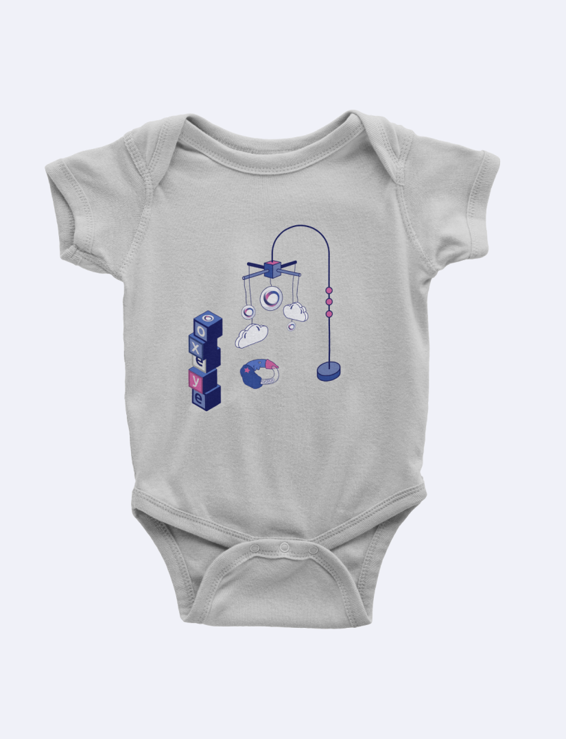
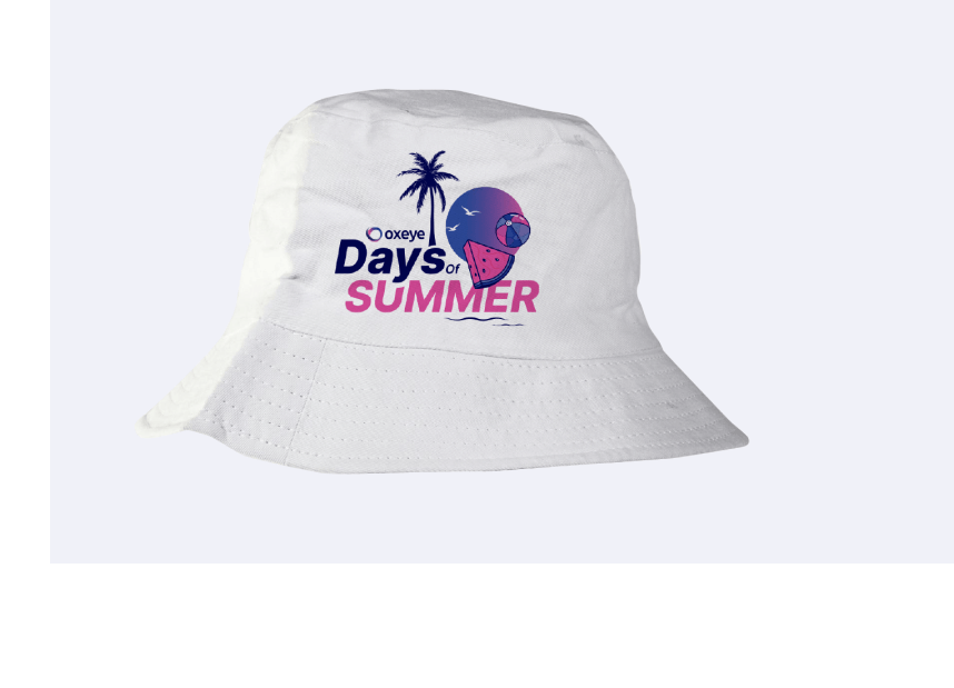
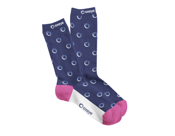
Marketing
Assets
Web Design
Web UX
Web Design
Design System
Development and QA
Design and Development
Our design process was centered around simplifying Oxeye’s solution, ensuring it could be easily understood by visitors. Through a combination of dark colors, light pink gradients, and subtle glass effects, we created a visually captivating website that effectively showcases the innovative technology behind the product.



Product Design
UX/UI
PRODUCT DESIGN
Design System
Challenge
Combine a long list of an application's issues and vulnerabilities with detailed information about each one, including a map of the cloud environment in context.
User Experience
The large amount of information available for each issue is divided into tabs by topic. Above them users can always see the issue’s identifier and severity, and change its remediation status.
In the diagram we show the detailed information of the selected issue relevant to the selected tab. In this case we can see the map, which helps the user orient themselves and gain visibility into their cloud environment. It also provides important information regarding the given issue - where it is within the environment and whether it is connected to the internet, for example.
Product Screens
The top part is where the user selects the type of item they want to analyze and its relevant parameters.Users can change their selections as necessary, and the analysis results at the bottom of the page will update accordingly when clicking on "Analyze".
Here the user can select which application to explore. Placing the selection at the top of the page, as part of the breadcrumbs, makes it intuitive and easy to find. It effortlessly tells the story of what the user is looking at.
The table contains the list of all of the issues found in the selected application, in the selected type of issue - the issue type itself can be selected from the main menu. Each row contains the relevant information the user needs so that they can choose which issue they want to dive into.
Product Screens
The top part is where the user selects the type of item they want to analyze and its relevant parameters.Users can change their selections as necessary, and the analysis results at the bottom of the page will update accordingly when clicking on "Analyze".
Design System
Typography
Empty States
Buttons
Colors
Let’s work together
Back to home page